Visualizing Data with Python
# import primary modules
import numpy as np  # useful for many scientific computing in Python
import pandas as pd # primary data structure library
import matplotlib as mpl
import matplotlib.pyplot as plt
import matplotlib.patches as mpatches # needed for waffle Charts

# optional: apply a style to Matplotlib
# print(plt.style.available)
mpl.style.use(['ggplot']) # optional: for ggplot-like style

# load the data
data = 'https://s3-api.us-geo.objectstorage.softlayer.net/cf-courses-data/CognitiveClass/DV0101EN/labs/Data_Files/Canada.xlsx'
df_can = pd.read_excel(data, sheet_name='Canada by Citizenship', skiprows=range(20), skipfooter=2)

# clean up data
df_can.drop(['AREA','REG','DEV','Type','Coverage'], axis = 1, inplace = True)

# let's rename the columns so that they make sense
df_can.rename (columns = {'OdName':'Country', 'AreaName':'Continent','RegName':'Region'}, inplace = True)

# set the country name as index - useful for quickly looking up countries using .loc method
df_can.set_index('Country', inplace = True)

# add total column
df_can['Total'] = df_can.iloc[:,3:].sum (axis = 1)

print ('data dimensions:', df_can.shape)
- Use line plots when you have a continuous data set.
- Best suited for trend-based visualizations of data over a period of time.
- Line plot is a handy tool to display several dependent variables against one independent variable.
- It is recommended that you have no more than 5-10 lines on a single graph
# get the index and columns as lists
columnList = df_can.columns.tolist()
indexList = df_can.index.tolist()
# convert the column names into strings
df_can.columns = list(map(str, df_can.columns))
years = list(map(str, range(1980, 2014)))

# filtering based on criteria
condition1 = df_can['Continent'] == 'Asia'
condition2 = df_can[(df_can['Continent']=='Asia') & (df_can['Region']=='Southern Asia')]
# line graph of immigration from Haiti
haiti = df_can.loc[['Haiti'], years]
haiti = haiti.transpose()
haiti.index = haiti.index.map(int)

haiti.plot(kind='line', figsize=(8, 6))
plt.title('Immigration from Haiti')
plt.ylabel('Number of Immigrants')
plt.xlabel('Years')
# annotate the 2010 Earthquake.
plt.text(2000, 6000, '2010 Earthquake')
plt.show()

# compare the number of immigrants from India and China from 1980 to 2013
df_CI = df_can.loc[['India', 'China'], years]
df_CI = df_CI.transpose()
df_CI.index = df_CI.index.map(int)

df_CI.plot(kind='line', figsize=(8, 6))
plt.title('Immigrants from China and India')
plt.ylabel('Number of Immigrants')
plt.xlabel('Years')
plt.show()

i. Other Plots
There are many other plotting styles available other than the default Line plot, all of which can be accessed by passing kind keyword to plot(). Two notable plots are as follows:
kdeordensityfor density plotshexbinfor hexbin plot
df_can.sort_values(['Total'], ascending=False, axis=0, inplace=True)

# transpose dataframe of top 5 entries
df_top5 = df_can.head()
df_top5 = df_top5[years].transpose()

df_top5.plot(kind='area', alpha=0.25, # stacked=False,
             figsize=(20, 10),)

plt.title('Immigration Trend of Top 5 Countries')
plt.ylabel('Number of Immigrants')
plt.xlabel('Years')
plt.show()

Best practices for using an area chart
- Avoid using it at all costs/as much as you can help it
- Use the duller stacked column chart instead. No cool jagged boundaries in this chart, but it does give a truer picture because it keeps your eye focused on the vertical.
Question: What is the immigration distribution for Denmark, Norway, and Sweden for years 1980 - 2013?
# transpose dataframe
df_t = df_can.loc[['Denmark', 'Norway', 'Sweden'], years].transpose()

# let's get the x-tick values
count, bin_edges = np.histogram(df_t, 15)

# un-stacked histogram
df_t.plot(kind ='hist', figsize=(10, 6), bins=15, alpha=0.6, # xlim=(xmin, xmax),
          xticks=bin_edges, color=['coral', 'darkslateblue', 'mediumseagreen'])
plt.title('Histogram of Immigration from Denmark, Norway, and Sweden from 1980 - 2013')
plt.ylabel('Number of Years')
plt.xlabel('Number of Immigrants')
plt.show()
# For a full listing of colors available in Matplotlib:
# for name, hex in matplotlib.colors.cnames.items():
#    print(name, hex)

# option 2 (stacked)
count, bin_edges = np.histogram(df_t, 15)
xmin = bin_edges[0] - 10   #  first bin value is 31.0, adding buffer of 10 for aesthetic purposes
xmax = bin_edges[-1] + 10  #  last bin value is 308.0, adding buffer of 10 for aesthetic purposes

# stacked Histogram
df_t.plot(kind='hist', figsize=(10, 6), bins=15, xticks=bin_edges,
          color=['coral', 'darkslateblue', 'mediumseagreen'], stacked=True, xlim=(xmin, xmax))
plt.title('Histogram of Immigration from Denmark, Norway, and Sweden from 1980 - 2013')
plt.ylabel('Number of Years')
plt.xlabel('Number of Immigrants')
plt.show()

Question: How do the number of Icelandic immigrants compare with those of Canada from year 1980 to 2013
Vertical Bar Plot
Vertical bar graphs are useful in analyzing time series data but they lack space for text labelling at the foot of each bar.
df_iceland = df_can.loc['Iceland', years]

df_iceland.plot(kind='bar', figsize=(10, 6), rot=90)
plt.xlabel('Year')
plt.ylabel('Number of Immigrants')
plt.title('Icelandic Immigrants to Canada from 1980 to 2013')

# Annotate arrow
plt.annotate('',                      # s: str. will leave it blank for no text
             xy=(32, 70),             # place head of the arrow at point (year 2012 , pop 70)
             xytext=(28, 20),         # place base of the arrow at point (year 2008 , pop 20)
             xycoords='data',         # will use the coordinate system of the object being annotated
             arrowprops=dict(arrowstyle='->', connectionstyle='arc3', color='blue', lw=2))

# Annotate Text
plt.annotate('2008 - 2011 Financial Crisis', # text to display
             xy=(28, 30),                    # start the text at at point (year 2008 , pop 30)
             rotation=72.5,                  # based on trial and error to match the arrow
             va='bottom',                    # want the text to be vertically 'bottom' aligned
             ha='left',                      # want the text to be horizontally 'left' algned.
            )
plt.show()

Horizontal Bar Plot
# sort dataframe on 'Total' column (descending)
df_can.sort_values(by='Total', ascending=True, inplace=True)

# get top 15 countries
df_top15 = df_can['Total'].tail(15)

# generate plot
df_top15.plot(kind='barh', figsize=(10, 10), color='steelblue')
plt.xlabel('Number of Immigrants')
plt.title('Top 15 Conuntries Contributing to the Immigration to Canada between 1980 - 2013')

# annotate value labels to each country
for index, value in enumerate(df_top15):
    label = format(int(value), ',') # format int with commas

    # place text at the end of bar (subtracting 47000 from x, and 0.1 from y to make it fit within the bar)
    plt.annotate(label, xy=(value - 47000, index - 0.10), color='white')
plt.show()

df_continents = df_can.groupby('Continent', axis=0).sum()
colors_list = ['gold', 'yellowgreen', 'lightcoral', 'lightskyblue', 'lightgreen', 'pink']
explode_list = [0.1, 0, 0, 0, 0.1, 0.1] # ratio for each continent with which to offset each wedge.

# for any particular year, replace 'Total' below with said year
df_continents['Total'].plot(kind='pie', figsize=(15, 6),
                            autopct='%1.1f%%',   # add in percentages
                            startangle=90,       # start angle 90° (Africa)
                            shadow=True,         # add shadow
                            labels=None,         # turn off labels on pie chart
                            pctdistance=1.12,    # the ratio between the center of each pie slice and the start of the text generated by autopct
                            colors=colors_list,  # add custom colors
                            explode=explode_list # 'explode' lowest 3 continents
                            )
# scale the title up by 12% to match pctdistance
plt.title('Immigration to Canada by Continent [1980 - 2013]', y=1.12)  # y is the space between title and chart
plt.axis('equal')
plt.legend(labels=df_continents.index, loc='upper left')
plt.show()

# Immigration to Canada from Japan from 1980 - 2013
fig = plt.figure() # create figure
# ax = fig.add_subplot(nrows, ncols, plot_number)
ax0 = fig.add_subplot(1, 3, 1) # add subplot 1 (1 row, 3 columns, first plot)
ax1 = fig.add_subplot(1, 3, 2) # add subplot 2 (1 row, 3 columns, second plot)
ax2 = fig.add_subplot(1, 3, 3) # add subplot 3 (1 row, 3 columns, third plot)
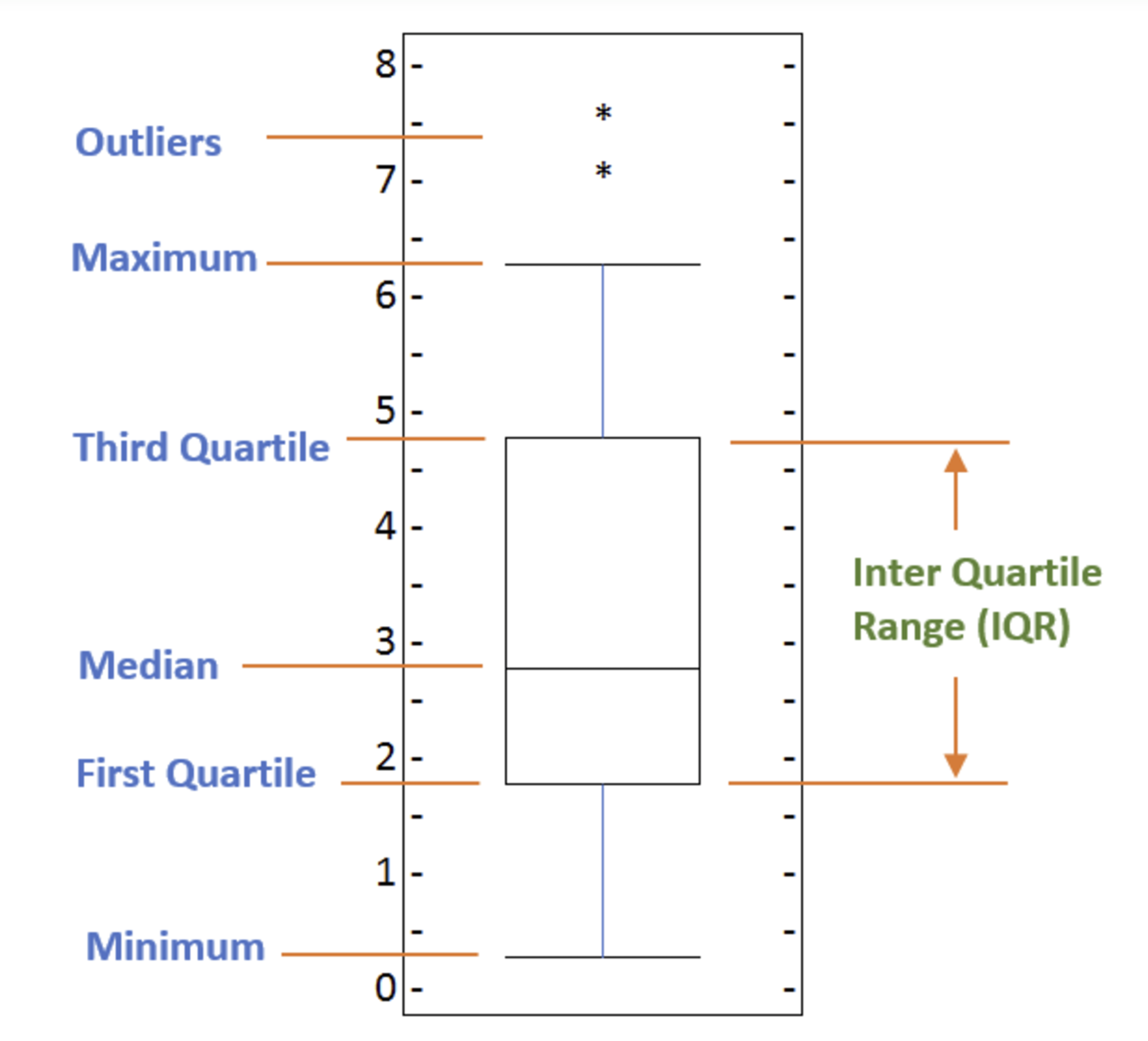
# Subplot 1: Box plot of Japanese Immigrants from 1980 - 2013'
df_japan = df_can.loc[['Japan'], years].transpose()
df_japan.plot(kind='box', figsize=(20, 6), ax=ax0)
ax0.set_title('Japanese Immigrants [1980 - 2013]')
ax0.set_xlabel('Countries')
ax0.set_ylabel('Number of Immigrants')
# Subplot 2: Box plots of Immigrants from China and India (1980 - 2013)
df_CI= df_can.loc[['China', 'India'], years].transpose()
df_CI.plot(kind='box', figsize=(20, 6), ax=ax1)
ax1.set_title('Immigrants from China and India [1980 - 2013]')
ax1.set_xlabel('Countries')
ax1.set_ylabel('Number of Immigrants')
# Subplot 3: Box plots of Immigrants from China and India (1980 - 2013) -- Horizontal
df_CI.plot(kind='box', figsize=(20, 6), color='blue', vert=False, ax=ax2)
ax2.set_title('Immigrants from China and India [1980 - 2013]')
ax2.set_xlabel('Number of Immigrants')
ax2.set_ylabel('Countries')
plt.show()

In order to be an outlier on a box plot, the data value must be:
- Larger than Q3 by at least 1.5 times the interquartile range (IQR), or,
- Smaller than Q1 by at least 1.5 times the IQR.
# we can use the sum() method to get the total population per year
df_tot = pd.DataFrame(df_can[years].sum(axis=0))

# change the years to type int (useful for regression later on)
df_tot.index = map(int, df_tot.index)

# reset the index to put in back in as a column in the df_tot dataframe
df_tot.reset_index(inplace = True)

df_tot.columns = ['year', 'total']
df_tot.plot(kind='scatter', x='year', y='total', figsize=(10, 6), color='darkblue')

plt.title('Total Immigration to Canada from 1980 - 2013')
plt.xlabel('Year')
plt.ylabel('Number of Immigrants')
plt.show()

We can clearly observe an upward trend in the data. We can mathematically analyze this upward trend using a regression line (line of best fit).
x = df_tot['year']      # year on x-axis
y = df_tot['total']     # total on y-axis
fit = np.polyfit(x, y, deg=1)

df_tot.plot(kind='scatter', x='year', y='total', figsize=(10, 6), color='darkblue')

plt.title('Total Immigration to Canada from 1980 - 2013')
plt.xlabel('Year')
plt.ylabel('Number of Immigrants')

# plot line of best fit
plt.plot(x, fit[0] * x + fit[1], color='red') # recall that x is the Years
plt.annotate('y={0:.0f} x + {1:.0f}'.format(fit[0], fit[1]), xy=(2000, 150000))

plt.show()

# print out the line of best fit
'No. Immigrants = {0:.0f} * Year + {1:.0f}'.format(fit[0], fit[1])

Using the equation of line of best fit, we can estimate the number of immigrants in 2015:
No. Immigrants = 5567 * Year - 10926195
No. Immigrants = 5567 * 2015 - 10926195
No. Immigrants = 291,310
When compared to the actuals from Citizenship and Immigration Canada's (CIC) 2016 Annual Report, we see that Canada accepted 271,845 immigrants in 2015. Our estimated value of 291,310 is within 7% of the actual number, which is pretty good considering our original data came from United Nations (and might differ slightly from CIC data).
A bubble plot is a variation of the scatter plot that displays three dimensions of data (x, y, z). The datapoints are replaced with bubbles, and the size of the bubble is determined by the third variable 'z', also known as the weight. In maplotlib, we can pass in an array or scalar to the keyword s to plot(), that contains the weight of each point.
Effect of Argentina's Great Depression
Argentina suffered a great depression from 1998 - 2002, which caused widespread unemployment, riots, the fall of the government, and a default on the country's foreign debt. In terms of income, over 50% of Argentines were poor, and seven out of ten Argentine children were poor at the depth of the crisis in 2002. Let's analyze the effect of this crisis, and compare Argentina's immigration to that of it's neighbour Brazil.
df_can_t = df_can[years].transpose() # transposed dataframe
df_can_t.index = map(int, df_can_t.index)
df_can_t.index.name = 'Year'
df_can_t.reset_index(inplace=True)

# normalize Brazil data
norm_brazil = (df_can_t['Brazil'] - df_can_t['Brazil'].min()) / (df_can_t['Brazil'].max() - df_can_t['Brazil'].min())
# normalize Argentina data
norm_argentina = (df_can_t['Argentina'] - df_can_t['Argentina'].min()) / (df_can_t['Argentina'].max() - df_can_t['Argentina'].min())

# Brazil
ax0 = df_can_t.plot(kind='scatter', x='Year', y='Brazil', figsize=(14, 8), alpha=0.5, # transparency
                    color='green', s=norm_brazil * 2000 + 10,  # pass in weights
                    xlim=(1975, 2015))
# Argentina
ax1 = df_can_t.plot(kind='scatter', x='Year', y='Argentina', alpha=0.5, color="blue",
                    s=norm_argentina * 2000 + 10, ax = ax0)
ax0.set_ylabel('Number of Immigrants')
ax0.set_title('Immigration from Brazil and Argentina from 1980 - 2013')
ax0.legend(['Brazil', 'Argentina'], loc='upper left', fontsize='x-large')
plt.show()

- We will pass in the weights using
s. Given that the normalized weights are between 0-1, they won't be visible on the plot. Therefore we will:- multiply weights by 2000 to scale it up on the graph, and,
- add 10 to compensate for the min value (which has a 0 weight and therefore scale with x2000).
The size of the bubble corresponds to the magnitude of immigrating population for that year, compared to the 1980 - 2013 data. The larger the bubble, the more immigrants in that year. From the plot above, we can see a corresponding increase in immigration from Argentina during the 1998 - 2002 great depression. We can also observe a similar spike around 1985 to 1993. In fact, Argentina had suffered a great depression from 1974 - 1990, just before the onset of 1998 - 2002 great depression. On a similar note, Brazil suffered the Samba Effect where the Brazilian real (currency) dropped nearly 35% in 1999. There was a fear of a South American financial crisis as many South American countries were heavily dependent on industrial exports from Brazil. The Brazilian government subsequently adopted an austerity program, and the economy slowly recovered over the years, culminating in a surge in 2010. The immigration data reflect these events.
A waffle chart is normally created to display progress toward goals. Unfortunately, unlike R, waffle charts are not built into any of the Python visualization libraries. Therefore, we will learn how to create them from scratch.
def create_waffle_chart(categories, values, height, width, colormap, value_sign=''):
    # compute the proportion of each category with respect to the total
    total_values = sum(values)
    category_proportions = [(float(value) / total_values) for value in values]

    # compute the total number of tiles
    total_num_tiles = width * height # total number of tiles

    # compute the number of tiles for each catagory
    tiles_per_category = [round(proportion * total_num_tiles) for proportion in category_proportions]

    # print out number of tiles per category
    for i, tiles in enumerate(tiles_per_category):
        print (df_dsn.index.values[i] + ': ' + str(tiles))

    # initialize the waffle chart as an empty matrix
    waffle_chart = np.zeros((height, width))

    # define indices to loop through waffle chart
    category_index = 0
    tile_index = 0

    # populate the waffle chart
    for col in range(width):
        for row in range(height):
            tile_index += 1

            # if the number of tiles populated for the current category
            # is equal to its corresponding allocated tiles...
            if tile_index > sum(tiles_per_category[0:category_index]):
                # ...proceed to the next category
                category_index += 1

            # set the class value to an integer, which increases with class
            waffle_chart[row, col] = category_index

    # instantiate a new figure object
    fig = plt.figure()

    # use matshow to display the waffle chart
    colormap = plt.cm.coolwarm
    plt.matshow(waffle_chart, cmap=colormap)
    plt.rcParams['axes.grid'] = False
    plt.colorbar()

    # get the axis
    ax = plt.gca()

    # set minor ticks
    ax.set_xticks(np.arange(-.5, (width), 1), minor=True)
    ax.set_yticks(np.arange(-.5, (height), 1), minor=True)

    # add dridlines based on minor ticks
    ax.grid(which='minor', color='w', linestyle='-', linewidth=2)

    plt.xticks([])
    plt.yticks([])

    # compute cumulative sum of individual categories to match color schemes between chart and legend
    values_cumsum = np.cumsum(values)
    total_values = values_cumsum[len(values_cumsum) - 1]

    # create legend
    legend_handles = []
    for i, category in enumerate(categories):
        if value_sign == '%':
            label_str = category + ' (' + str(values[i]) + value_sign + ')'
        else:
            label_str = category + ' (' + value_sign + str(values[i]) + ')'
        color_val = colormap(float(values_cumsum[i])/total_values)
        legend_handles.append(mpatches.Patch(color=color_val, label=label_str))

    # add legend to chart
    plt.legend(
        handles=legend_handles,
        loc='lower center',
        ncol=len(categories),
        bbox_to_anchor=(0., -0.2, 0.95, .1))
    plt.show()
# let's create a new dataframe for these three countries
df_dsn = df_can.loc[['Denmark', 'Norway', 'Sweden'], :]

width = 40 # width of chart
height = 10 # height of chart

categories = df_dsn.index.values # categories
values = df_dsn['Total'] # correponding values of categories

colormap = plt.cm.coolwarm # color map class

create_waffle_chart(categories, values, height, width, colormap)

# pip install wordcloud
# import package and its set of stopwords
from wordcloud import WordCloud, STOPWORDS

stopwords = set(STOPWORDS)

# 'said' isn't really an informative word. So let's add it to our stopwords
stopwords.add('said')

# download file and save as alice_novel.txt
!wget --quiet https://s3-api.us-geo.objectstorage.softlayer.net/cf-courses-data/CognitiveClass/DV0101EN/labs/Data_Files/alice_novel.txt
# open the file and read it into a variable alice_novel
alice_novel = open('alice_novel.txt', 'r').read()


# instantiate a word cloud object
alice_wc = WordCloud(
    background_color='white',
    max_words=2000, # using only the first 2000 words in the novel for simplicity
    stopwords=stopwords)

# generate the word cloud
alice_wc.generate(alice_novel)

# resize the cloud
fig = plt.figure()
fig.set_figwidth(14) # set width
fig.set_figheight(18) # set height

# display the word cloud
plt.imshow(alice_wc, interpolation='bilinear')
plt.axis('off')
plt.show()

#  superimpose the words onto a mask of any shape

from PIL import Image # converting images into arrays
# download image
!wget --quiet https://s3-api.us-geo.objectstorage.softlayer.net/cf-courses-data/CognitiveClass/DV0101EN/labs/Images/alice_mask.png

# save mask to alice_mask
alice_mask = np.array(Image.open('alice_mask.png'))

fig = plt.figure()
fig.set_figwidth(14) # set width
fig.set_figheight(18) # set height

plt.imshow(alice_mask, cmap=plt.cm.gray, interpolation='bilinear')
plt.axis('off')
plt.show()

# instantiate a word cloud object
alice_wc = WordCloud(background_color='white', max_words=2000, mask=alice_mask, stopwords=stopwords)

# generate the word cloud
alice_wc.generate(alice_novel)

# display the word cloud
fig = plt.figure()
fig.set_figwidth(14) # set width
fig.set_figheight(18) # set height

plt.imshow(alice_wc, interpolation='bilinear')
plt.axis('off')
plt.show()

# import library
import seaborn as sns
mpl.style.use('ggplot')

# Create a new dataframe that stores that total number of landed immigrants to Canada per year from 1980 to 2013.

# we can use the sum() method to get the total population per year
df_tot = pd.DataFrame(df_can[years].sum(axis=0))

# change the years to type float (useful for regression later on)
df_tot.index = map(float, df_tot.index)

# reset the index to put in back in as a column in the df_tot dataframe
df_tot.reset_index(inplace=True)

# rename columns
df_tot.columns = ['year', 'total']
plt.figure(figsize=(15, 10))
sns.set(font_scale=1.5)
ax = sns.regplot(x='year', y='total', data=df_tot, color='green', marker='+', scatter_kws={'s': 200})
ax.set(xlabel='Year', ylabel='Total Immigration') # add x- and y-labels
ax.set_title('Total Immigration to Canada from 1980 - 2013') # add title

# If you are not a big fan of the purple background, you can easily change the style to a white plain background.
plt.figure(figsize=(15, 10))
sns.set(font_scale=1.5)
sns.set_style('ticks') # change background to white background
# sns.set_style('whitegrid')
ax = sns.regplot(x='year', y='total', data=df_tot, color='green', marker='+', scatter_kws={'s': 200})
ax.set(xlabel='Year', ylabel='Total Immigration')
ax.set_title('Total Immigration to Canada from 1980 - 2013')

Question: Use seaborn to create a scatter plot with a regression line to visualize the total immigration from Denmark, Sweden, and Norway to Canada from 1980 to 2013.
# create df_countries dataframe
df_countries = df_can.loc[['Denmark', 'Norway', 'Sweden'], years].transpose()

# create df_total by summing across three countries for each year
df_total = pd.DataFrame(df_countries.sum(axis=1))

# reset index in place
df_total.reset_index(inplace=True)

# rename columns
df_total.columns = ['year', 'total']

# change column year from string to int to create scatter plot
df_total['year'] = df_total['year'].astype(int)

# define figure size
plt.figure(figsize=(15, 10))

# define background style and font size
sns.set(font_scale=1.5)
sns.set_style('whitegrid')

# generate plot and add title and axes labels
ax = sns.regplot(x='year', y='total', data=df_total, color='green', marker='+', scatter_kws={'s': 200})
ax.set(xlabel='Year', ylabel='Total Immigration')
ax.set_title('Total Immigrationn from Denmark, Sweden, and Norway to Canada from 1980 - 2013')

Folium
While other libraries are available to visualize geospatial data, such as plotly, they might have a cap on how many API calls you can make within a defined time frame. Folium, on the other hand, is completely free. This library also makes for a useful dashboarding tool because its results are interactive
Folium builds on the data wrangling strengths of the Python ecosystem and the mapping strengths of the Leaflet.js library. Manipulate your data in Python, then visualize it in on a Leaflet map via Folium.
It enables both the binding of data to a map for choropleth visualizations as well as passing Vincent/Vega visualizations as markers on the map.
Exploring the Datasets
- San Francisco Police Department Incidents for the year 2016 - Updated daily
- Immigration to Canada from 1980 to 2013 Annual data on the flows of international migrants as recorded by the countries of destination. The data presents both inflows and outflows according to the place of birth, citizenship or place of previous / next residence both for foreigners and nationals
- Location has been anonymized by moving to mid-block or to an intersection
# pip install folium
import folium

# define the world map
world_map = folium.Map()

# display world map
world_map
# define the world map centered around Canada with a low zoom level
canada_latitude = 56.130
canada_longitude = -106.35
world_map = folium.Map(location=[canada_latitude, canada_longitude], zoom_start=4)
world_map
A. Stamen Toner Maps
High-contrast B+W (black and white) maps. They are perfect for data mashups and exploring river meanders and coastal zones.
# create a Stamen Toner map of the world centered around Canada
world_map = folium.Map(location=[56.130, -106.35], zoom_start=4, tiles='Stamen Toner')

# display map
world_map
B. Stamen Terrain Maps
They feature hill shading and natural vegetation colors. They showcase advanced labeling and linework generalization of dual-carriageway roads.
# create a Stamen Toner map of the world centered around Canada
world_map = folium.Map(location=[56.130, -106.35], zoom_start=4, tiles='Stamen Terrain')

# display map
world_map
C. Mapbox Bright Maps
These are similar to the default style, except that the borders are not visible with a low zoom level. Furthermore, unlike the default style where country names are displayed in each country's native language, Mapbox Bright style displays all country names in English.
# create a world map with a Mapbox Bright style.
world_map = folium.Map(tiles='OpenStreetMap')

# # display the map
world_map
D. Maps with Markers
df_incidents = pd.read_csv('https://s3-api.us-geo.objectstorage.softlayer.net/cf-courses-data/CognitiveClass/DV0101EN/labs/Data_Files/Police_Department_Incidents_-_Previous_Year__2016_.csv')
df_incidents.head()
So each row consists of 13 features:
- IncidntNum: Incident Number
- Category: Category of crime or incident
- Descript: Description of the crime or incident
- DayOfWeek: The day of week on which the incident occurred
- Date: The Date on which the incident occurred
- Time: The time of day on which the incident occurred
- PdDistrict: The police department district
- Resolution: The resolution of the crime in terms whether the perpetrator was arrested or not
- Address: The closest address to where the incident took place
- X: The longitude value of the crime location
- Y: The latitude value of the crime location
- Location: A tuple of the latitude and the longitude values
- PdId: The police department ID
# get the first 100 crimes in the df_incidents dataframe
limit = 100
df_incidents = df_incidents.iloc[0:limit, :]

# San Francisco latitude and longitude values
latitude = 37.77
longitude = -122.42

# create map and display it
sanfran_map = folium.Map(location=[latitude, longitude], zoom_start=12)

# loop through the 100 crimes and add each to the map
for lat, lng, label in zip(df_incidents.Y, df_incidents.X, df_incidents.Category):
    folium.CircleMarker(
        [lat, lng],
        radius=5, # define how big you want the circle markers to be
        color='yellow',
        fill=True,
        popup=label,
        fill_color='blue',
        fill_opacity=0.6
    ).add_to(sanfran_map)

# show map
sanfran_map
E. Choropleth Maps
A Choropleth map is a thematic map in which areas are shaded or patterned in proportion to the measurement of the statistical variable being displayed on the map, such as population density or per-capita income. The choropleth map provides an easy way to visualize how a measurement varies across a geographic area or it shows the level of variability within a region.
df_can = pd.read_excel('https://s3-api.us-geo.objectstorage.softlayer.net/cf-courses-data/CognitiveClass/DV0101EN/labs/Data_Files/Canada.xlsx',
                     sheet_name='Canada by Citizenship',
                     skiprows=range(20), skipfooter=2)

# clean up the dataset to remove unnecessary columns (eg. REG)
df_can.drop(['AREA','REG','DEV','Type','Coverage'], axis=1, inplace=True)

# let's rename the columns so that they make sense
df_can.rename(columns={'OdName':'Country', 'AreaName':'Continent','RegName':'Region'}, inplace=True)

# for sake of consistency, let's also make all column labels of type string
df_can.columns = list(map(str, df_can.columns))

# add total column
df_can['Total'] = df_can.iloc[:,4:].sum (axis = 1)

# years that we will be using in this lesson - useful for plotting later on
years = list(map(str, range(1980, 2014)))

# import wget
# url = 'https://s3-api.us-geo.objectstorage.softlayer.net/cf-courses-data/CognitiveClass/DV0101EN/labs/Data_Files/world_countries.json'
# filename = wget.download(url)

!wget --quiet https://s3-api.us-geo.objectstorage.softlayer.net/cf-courses-data/CognitiveClass/DV0101EN/labs/Data_Files/world_countries.json -O world_countries.json

#create a world map, centered around [0, 0] latitude and longitude values
world_geo = r'world_countries.json' # geojson file


# create a numpy array of length 6 and has linear spacing from the minium total immigration to the maximum total immigration
threshold_scale = np.linspace(df_can['Total'].min(),
                              df_can['Total'].max(),
                              6, dtype=int)
threshold_scale = threshold_scale.tolist() # change the numpy array to a list
threshold_scale[-1] = threshold_scale[-1] + 1 # make sure that the last value of the list is greater than the maximum immigration


# create a plain world map
world_map = folium.Map(location=[0, 0], zoom_start=2, tiles='openstreetmap')

# let Folium determine the scale.
world_map = folium.Map(location=[0, 0], zoom_start=2, tiles='openstreetmap')
world_map.choropleth(
    geo_data=world_geo,
    data=df_can,
    columns=['Country', 'Total'],
    key_on='feature.properties.name',
    threshold_scale=threshold_scale,
    fill_color='YlOrRd',
    fill_opacity=0.7,
    line_opacity=0.2,
    legend_name='Immigration to Canada',
    reset=True
)
world_map
aside: How to move a file
import os
import shutil
os.rename("path/to/current/file.foo", "path/to/new/destination/for/file.foo")
shutil.move("path/to/current/file.foo", "path/to/new/destination/for/file.foo")
os.replace("path/to/current/file.foo", "path/to/new/destination/for/file.foo")