Machine Learning with Python
Table of contents
Regression is the process of predicting a continuous value, such as Co2 emission by using other variables
i. Linear Regression
- Linear regression is the approximation of a linear model used to describe the relationship between
two or more variables
- Dependent variable should (always) be continuous; never a discrete value.
- Independent variable(s) can be measured on either a categorical or continuous measurement scale.
Simple Linear Regression
SLR refers to one independent variable to make a prediction. The result of Linear Regression is a linear function that predicts the response (dependent) variable as a function of the predictor (independent) variable.
$$ X: Predictor/Independent \ Variables\\ Y: Response/Target/Dependent \ Variable $$$$Linear function: Yhat = a + b X $$- a -- the intercept of the regression line; in other words: the value of Y when X is 0
- b -- the slope of the regression line, in other words: the value with which Y changes when X increases by 1 unit
import matplotlib.pyplot as plt
import pandas as pd
import pylab as pl
import numpy as np
%matplotlib inline

!wget -O FuelConsumption.csv http://s3-api.us-geo.objectstorage.softlayer.net/cf-courses-data/CognitiveClass/ML0101ENv3/labs/FuelConsumptionCo2.csv
# Reading the data in
df = pd.read_csv("FuelConsumption.csv")
#  select some features that we want to use for regression
cdf = df[['ENGINESIZE','CYLINDERS','FUELCONSUMPTION_COMB','CO2EMISSIONS']]

fig, (ax1, ax2, ax3) = plt.subplots(1, 3, sharey=True)
cdf[['FUELCONSUMPTION_COMB', 'CO2EMISSIONS']].plot(
    kind='scatter', x='FUELCONSUMPTION_COMB', y='CO2EMISSIONS', figsize=(20, 6), ax=ax1)
cdf[['ENGINESIZE', 'CO2EMISSIONS']].plot(kind='scatter', x='ENGINESIZE', y='CO2EMISSIONS', figsize=(20, 6), ax=ax2)
cdf[['CYLINDERS', 'CO2EMISSIONS']].plot(kind='scatter', x='CYLINDERS', y='CO2EMISSIONS', figsize=(20, 6), ax=ax3)
plt.show()

Train Test Split
Train/Test Split involves splitting the dataset into mutually exclusive training and testing sets. After which, you train with the training set and test with the testing set. This will provide a more accurate evaluation on out-of-sample accuracy because the testing dataset is not part of the dataset that has been used to train the data. It is more realistic for real world problems.
Out of Sample Accuracy refers to the percentage of correct predictions that the model makes on data that the model has NOT been trained on. Doing a train and test on the same dataset will most likely have low out-of-sample accuracy, due to the likelihood of being over-fit.It is important that our models have a high, out-of-sample accuracy, because the purpose of any model, of course, is to make correct predictions on unknown data.
# Split dataset into train and test sets-(80% for training; 20% for testing)
# We create a mask to select random rows using np.random.rand() function:
msk = np.random.rand(len(df)) < 0.8
train = cdf[msk]
test = cdf[~msk]
Modeling
# Using sklearn package to model data
from sklearn import linear_model
regr = linear_model.LinearRegression()
train_x = np.asanyarray(train[['ENGINESIZE']])
train_y = np.asanyarray(train[['CO2EMISSIONS']])

# Fit the linear model
regr.fit (train_x, train_y)

# The coefficients
print ('Coefficients: ', regr.coef_)
print ('Intercept: ',regr.intercept_)
# plot the fit line over the data:
plt.scatter(train.ENGINESIZE, train.CO2EMISSIONS,  color='blue')
plt.plot(train_x, regr.coef_[0][0]*train_x + regr.intercept_[0], '-r')
plt.xlabel("Engine size")
plt.ylabel("Emission")

Evaluation
We compare the actual values and predicted values to calculate the accuracy of a regression model.There are many different model evaluation metrics:
Mean Absolute Error:
The mean of the absolute value of the errors.Mean Squared Error (MSE):
The mean of the squared error. Its focus is geared more towards large errors. This is due to the squared term exponentially increasing larger errors in comparison to smaller onesRoot Mean Squared Error (RMSE)
The square root of the mean squared error.Relative Absolute Error
Also known as residual sum of square, where y bar is a mean value of y. Relative Absolute Error takes the total absolute error and normalizes it by dividing by the total absolute error of the sample predictorRelative Squared Error
very similar to relative absolute error. It is used for calculating R squaredR-squared
Not really an error. It represents how close the data are to the fitted regression line. The higher the R-squared, the better the model fits your data. Best possible score is 1.0 and it can be negative (because the model can be arbitrarily worse).
The choice of metric completely depends on the type of model, your data type, and domain of knowledge.
from sklearn.metrics import r2_score

test_x = np.asanyarray(test[['ENGINESIZE']])
test_y = np.asanyarray(test[['CO2EMISSIONS']])

# prediction/ predicted values
test_y_ = regr.predict(test_x)

print("Mean absolute error: %.2f" % np.mean(np.absolute(test_y_ - test_y)))
print("Residual sum of squares (MSE): %.2f" % np.mean((test_y_ - test_y) ** 2))
print("R2-score: %.2f" % r2_score(test_y_ , test_y) )
Multiple Linear Regression
Multiple Linear Regression -- an extension of simple linear regression -- is used to explain the relationship between one continuous response (dependent) variable and two or more predictor (independent) variables. Most of the real-world regression models involve multiple predictors. We will illustrate the structure by using four predictor variables, but these results can generalize to any integer:
$$ Y: Response \ Variable\\ X_1 :Predictor\ Variable \ 1\\ X_2: Predictor\ Variable \ 2\\ X_3: Predictor\ Variable \ 3\\ X_4: Predictor\ Variable \ 4\\ $$$$ a: intercept\\ b_1 :coefficients \ of\ Variable \ 1\\ b_2: coefficients \ of\ Variable \ 2\\ b_3: coefficients \ of\ Variable \ 3\\ b_4: coefficients \ of\ Variable \ 4\\ $$$$ Yhat = a + b_1 X_1 + b_2 X_2 + b_3 X_3 + b_4 X_4 $$# Reading the data in
df = pd.read_csv("FuelConsumption.csv")
# Select some features that we want to use for regression
cdf = df[['ENGINESIZE','CYLINDERS','FUELCONSUMPTION_CITY','FUELCONSUMPTION_HWY','FUELCONSUMPTION_COMB','CO2EMISSIONS']]
# plot Emission values with respect to Engine size
plt.scatter(cdf.ENGINESIZE, cdf.CO2EMISSIONS, color='blue')
plt.xlabel("Engine size")
plt.ylabel("Emission")
plt.show()

Train Test Split
# split dataset into train and test sets - (80% for training; 20% for testing)
# We create a mask to select random rows using np.random.rand() function:
msk = np.random.rand(len(df)) < 0.8
train = cdf[msk]
test = cdf[~msk]
Modeling
# Using sklearn package to model data
from sklearn import linear_model
regr = linear_model.LinearRegression()
x = np.asanyarray(train[['ENGINESIZE','CYLINDERS','FUELCONSUMPTION_COMB']])
y = np.asanyarray(train[['CO2EMISSIONS']])

# Fit the linear model
regr.fit (x, y)

# The coefficients
print ('Coefficients: ', regr.coef_)
print ('Intercept: ',regr.intercept_)
Evaluation
"""Sklearn passes a warning when we don't have labels on our input data,
but it only does that on sklearn versions at or past 1.0. This shouldn't
affect the output of your code at all. As of now you can just ignore this warning using 'warnings'"""
import warnings
with warnings.catch_warnings():
    warnings.simplefilter("ignore")
    # Prediction
    y_hat= regr.predict(test[['ENGINESIZE','CYLINDERS','FUELCONSUMPTION_COMB']])
    x = np.asanyarray(test[['ENGINESIZE','CYLINDERS','FUELCONSUMPTION_COMB']])
    y = np.asanyarray(test[['CO2EMISSIONS']])

    print("Residual sum of squares: %.2f"
      % np.mean((y_hat - y) ** 2))

    # Explained variance score: 1 is perfect prediction
    print('Variance score: %.2f' % regr.score(x, y))
Adding too many independent variables without any theoretical justification may result in an overfit model. An overfit model is a real problem because it is too complicated for your data set and not general enough to be used for prediction.
Categorical independent variables can be incorporated into a regression model by converting them into numerical variables. For example, given a binary variable such as car type, zero can represent manual and one for automatic cars.
Remember that multiple linear regression is a specific type of linear regression. So, there needs to be a linear relationship between the dependent variable and each of your independent variables. There are a number of ways to check for linear relationship. For example, you can use scatter plots and then visually checked for linearity. If the relationship displayed in your scatter plot is not linear, then you need to use non-linear regression.
ii. Polynomial Regression
In statistics, polynomial regression is a form of regression analysis in which the relationship between the independent variable x and the dependent variable y is modelled as an nth degree polynomial in x. Polynomial regression fits a nonlinear relationship between the value of x and the corresponding conditional mean of y, denoted E(y |x). Although polynomial regression fits a nonlinear model to the data, as a statistical estimation problem it is linear, in the sense that the regression function E(y | x) is linear in the unknown parameters that are estimated from the data. For this reason, polynomial regression is considered to be a special case of multiple linear regression.
Say you want a 2 degree polynomial regression: $y = b + \theta_1 x + \theta_2 x^2$
How can you fit your data on this equation when you have only x values, such as Engine Size?
Create a few additional features: 1, $x$, and $x^2$.
fit_transform takes the x values, and outputs a list of our data raised from power of 0 to power of 2 (since we set the degree of our polynomial to 2).
$ \begin{bmatrix} v_1\\ v_2\\ \vdots\\ v_n \end{bmatrix} $ $\longrightarrow$ $ \begin{bmatrix} [ 1 & v_1 & v_1^2]\\ [ 1 & v_2 & v_2^2]\\ \vdots & \vdots & \vdots\\ [ 1 & v_n & v_n^2] \end{bmatrix} $
in our example:
$ \begin{bmatrix} 2.\\ 2.4\\ 1.5\\ \vdots \end{bmatrix} $ $\longrightarrow$ $ \begin{bmatrix} [ 1 & 2. & 4.]\\ [ 1 & 2.4 & 5.76]\\ [ 1 & 1.5 & 2.25]\\ \vdots & \vdots & \vdots\\ \end{bmatrix} $
df = pd.read_csv("FuelConsumption.csv")
cdf = df[['ENGINESIZE','CYLINDERS','FUELCONSUMPTION_COMB','CO2EMISSIONS']]
# plot Emission values with respect to Engine size
plt.scatter(cdf.ENGINESIZE, cdf.CO2EMISSIONS,  color='blue')
plt.xlabel("Engine size")
plt.ylabel("Emission")
plt.show()
Train Test Split
from sklearn.preprocessing import PolynomialFeatures
from sklearn import linear_model

# Create train and test datasets
msk = np.random.rand(len(df)) < 0.8
train = cdf[msk]
test = cdf[~msk]

train_x = np.asanyarray(train[['ENGINESIZE']])
train_y = np.asanyarray(train[['CO2EMISSIONS']])

test_x = np.asanyarray(test[['ENGINESIZE']])
test_y = np.asanyarray(test[['CO2EMISSIONS']])

poly = PolynomialFeatures(degree=2)
train_x_poly = poly.fit_transform(train_x)
train_x_poly
Modeling
clf = linear_model.LinearRegression()
train_y_ = clf.fit(train_x_poly, train_y)
# The coefficients
print ('Coefficients: ', clf.coef_)
print ('Intercept: ',clf.intercept_)
plt.scatter(train.ENGINESIZE, train.CO2EMISSIONS,  color='blue')
XX = np.arange(0.0, 10.0, 0.1)
yy = clf.intercept_[0]+ clf.coef_[0][1]*XX+ clf.coef_[0][2]*np.power(XX, 2)
plt.plot(XX, yy, '-r' )
plt.xlabel("Engine size")
plt.ylabel("Emission")

Evaluation
from sklearn.metrics import r2_score

test_x_poly = poly.fit_transform(test_x)
test_y_ = clf.predict(test_x_poly)

print("Mean absolute error: %.2f" % np.mean(np.absolute(test_y_ - test_y)))
print("Residual sum of squares (MSE): %.2f" % np.mean((test_y_ - test_y) ** 2))
print("R2-score: %.2f" % r2_score(test_y_ , test_y) )
iii. Nonlinear Regression
If the data shows a curvy trend, then linear regression will not produce very accurate results when compared to a non-linear regression because, as the name implies, linear regression presumes that the data is linear.
- Any relationship that is non-linear is usually represented by a polynomial of $k$ degrees.
- Non-linear functions can also have elements like exponents, logarithms, fractions, etc:
Train Test Split
#downloading dataset
#if wget gives you problems, use http instead of https
!wget -nv -O china_gdp.csv http://s3-api.us-geo.objectstorage.softlayer.net/cf-courses-data/CognitiveClass/ML0101ENv3/labs/china_gdp.csv

df = pd.read_csv("china_gdp.csv")
x_data, y_data = (df["Year"].values, df["Value"].values)
# Our task here is to find the best parameters for our model
# Lets normalize our data
xdata = x_data/max(x_data)
ydata = y_data/max(y_data)
# write your code here
# split data into train/test
msk = np.random.rand(len(df)) < 0.8
train_x = xdata[msk]
test_x = xdata[~msk]
train_y = ydata[msk]
test_y = ydata[~msk]
Modeling
def sigmoid(x, Beta_1, Beta_2):
     y = 1 / (1 + np.exp(-Beta_1*(x-Beta_2)))
     return y
How do we find the best parameters for our fit line?
we can use curve_fit which uses non-linear least squares to fit our sigmoid function, to data. Optimal values for the parameters so that the sum of the squared residuals of sigmoid(xdata, *popt) - ydata is minimized.
popt are our optimized parameters.
from scipy.optimize import curve_fit

# build the model using train set
popt, pcov = curve_fit(sigmoid, train_x, train_y)
plt.scatter(xdata, ydata,  color='blue', label='data')
plt.plot(train_x, sigmoid(train_x, *popt), color='red', label='fit')
plt.legend(loc='best')
plt.ylabel('GDP')
plt.xlabel('Year')
plt.show()

Evaluation
# predict using test set
y_hat = sigmoid(test_x, *popt)

# evaluation
print("Mean absolute error: %.2f" % np.mean(np.absolute(y_hat - test_y)))
print("Residual sum of squares (MSE): %.2f" % np.mean((y_hat - test_y) ** 2))
from sklearn.metrics import r2_score
print("R2-score: %.2f" % r2_score(y_hat , test_y) )
In all non-linear equations, the change of Y_hat depends on changes in the parameters Theta, not necessarily on X only. In contrast to linear regression, we cannot use the ordinary least squares method to fit the data in non-linear regression
How can one easily tell if a problem is linear or non-linear?
- Visually figure out if the relation is linear or non-linear.
Plot bivariate plots of output variables with each input variable.
Also, you can calculate the correlation coefficient between independent and dependent variables, and if, for all variables, it is 0.7 or higher, there is a linear tendency- Ue non-linear regression instead of linear regression when we cannot accurately model the relationship with linear parameters.
How should one model data if it displays non-linear on a scatter plot?
- Use either a polynomial regression, a non-linear regression model, or transform your data
How can we improve out-of-sample accuracy?
- Use an evaluation approach called train/test split
The model is built on the training set. Then, the test feature set is passed to the model for prediction. Finally, the predicted values for the test set are compared with the actual values of the testing set. Ensure that you train your model with the testing set afterwards, as you don't want to lose potentially valuable data.- K-Fold Cross-Validation
The issue with train/test split is that it's highly dependent on the datasets on which the data was trained and tested. The variation of this causes train/test split to have a better out-of-sample prediction than training and testing on the same dataset, but it still has some problems due to this dependency. Another evaluation model, called K-fold cross-validation, resolves most of these issues.
How do you fix a high variation that results from a dependency? Well, you average it. In KFCV, if we have K equals four folds, then we split up the dataset into 4 folds.- In the first fold, for example, we use the first 25 percent of the dataset for testing and the rest for training. The model is built using the training set and is evaluated using the test set.
- In the second fold, the second 25 percent of the dataset is used for testing and the rest for training the model. Again, the accuracy of the model is calculated.
- We continue for all folds.
- Finally, the result of all four evaluations are averaged. That is, the accuracy of each fold is then averaged, keeping in mind that each fold is distinct, where no training data in one fold is used in another. K-fold cross-validation in its simplest form performs multiple train/test splits, using the same dataset where each split is different. Then, the result is averaged to produce a more consistent out-of-sample accuracy.
Applications for classification include:
- Email filtering
- Speech Recognition
- Handwriting Recognition
- Biometric Identification
- Document Classification
Types of Classification Algorithms
- k-nearest neighbor
- Decision trees
- Logistic regression
- Support vector machines
- Naive bayes
- Linear discriminant analysis
- Neural networks
i. K-Nearest Neighbors
- A method for classifying cases based on their similarity to other cases
- Cases that are near each other are said to be 'neighbors'
import numpy as np
import pandas as pd
import matplotlib.pyplot as plt
from sklearn import preprocessing
#%matplotlib inline
Imagine a telecommunications provider has segmented its customer base by service usage patterns, categorizing the customers into four groups.If demographic data can be used to predict group membership, the company can customize offers for individual prospective customers. Our objective is to build a classifier. That is, given the dataset, with predefined labels, we need to build a model (the classifier) to predict the class of new or unknown cases.
The target field, called custcat, has four possible values that correspond to the four customer groups, as follows:
- 1 - Basic Service
- 2 - E-Service
- 3 - Plus Service
- 4 - Total Service
#download the dataset
#!wget -O teleCust1000t.csv https://cf-courses-data.s3.us.cloud-object-storage.appdomain.cloud/IBMDeveloperSkillsNetwork-ML0101EN-SkillsNetwork/labs/Module%203/data/teleCust1000t.csv
#!wget --help

file = "https://cf-courses-data.s3.us.cloud-object-storage.appdomain.cloud/IBMDeveloperSkillsNetwork-ML0101EN-SkillsNetwork/labs/Module%203/data/teleCust1000t.csv"
df = pd.read_csv(file, delimiter=",")
# Data Visualization and Analysis
# how many of each class is in data set
df['custcat'].value_counts()
#easily explore your data using visualization techniques
df.hist(column='income', bins=50)

#define feature sets, X:
df.columns

#To use scikit-learn library, we have to convert the Pandas data frame to a Numpy array:
X = df[['region', 'tenure','age', 'marital', 'address', 'income', 'ed', 'employ','retire', 'gender', 'reside']] .values  #.astype(float)

#What are our labels?
y = df['custcat'].values

# Standardize features by removing the mean and scaling to unit variance
X = preprocessing.StandardScaler().fit(X).transform(X.astype(float))
X[0:5]
Train Test Split
from sklearn.model_selection import train_test_split
X_train, X_test, y_train, y_test = train_test_split( X, y, test_size=0.2, random_state=4)
print ('Train set:', X_train.shape,  y_train.shape)
print ('Test set:', X_test.shape,  y_test.shape)
Modeling
#Import library
#Classifier implementing the k-nearest neighbors vote.
from sklearn.neighbors import KNeighborsClassifier

# Training
#Lets start the algorithm with k=4 for now:
k = 4
#Train Model and Predict
neigh = KNeighborsClassifier(n_neighbors = k).fit(X_train,y_train)
neigh

# Testing/Predicting
#we can use the model to predict the test set:
yhat = neigh.predict(X_test)
yhat[0:5]
Evaluation
Evaluation Metrics
- Jaccard index
- F1 score
- Log loss
In multilabel classification, accuracy classification score is a function that computes subset accuracy. This function is equal to the jaccard_score function. Essentially, it calculates how closely the actual labels and predicted labels are matched in the test set.
from sklearn import metrics
print("Train set Accuracy: ", metrics.accuracy_score(y_train, neigh.predict(X_train)))
print("Test set Accuracy: ", metrics.accuracy_score(y_test, yhat))
What about other K?
K in KNN, is the number of nearest neighbors to examine. It is supposed to be specified by the User. So, how can we choose right value for K? The general solution is to reserve a part of your data for testing the accuracy of the model. Then chose k =1, use the training part for modeling, and calculate the accuracy of prediction using all samples in your test set. Repeat this process, increasing the k, and see which k is the best for your model.
Ks = 10
mean_acc = np.zeros((Ks-1))
std_acc = np.zeros((Ks-1))

for n in range(1,Ks):

    #Train Model and Predict
    neigh = KNeighborsClassifier(n_neighbors = n).fit(X_train,y_train)
    yhat=neigh.predict(X_test)
    mean_acc[n-1] = metrics.accuracy_score(y_test, yhat)

    std_acc[n-1]=np.std(yhat==y_test)/np.sqrt(yhat.shape[0])

mean_acc
Plot model accuracy for Different number of Neighbors
plt.plot(range(1,Ks),mean_acc,'g')
plt.fill_between(range(1,Ks),mean_acc - 1 * std_acc,mean_acc + 1 * std_acc, alpha=0.10)
plt.fill_between(range(1,Ks),mean_acc - 3 * std_acc,mean_acc + 3 * std_acc, alpha=0.10,color="green")
plt.legend(('Accuracy ', '+/- 1xstd','+/- 3xstd'))
plt.ylabel('Accuracy ')
plt.xlabel('Number of Neighbors (K)')
plt.tight_layout()
plt.show()

print( "The best accuracy was with", mean_acc.max(), "with k=", mean_acc.argmax()+1)
ii. Decision Trees
Decision trees are built using recursive partitioning to classify data.
Decision Tree Learningn Algorithm:
- Choose an attribute from your dataset
- Calculate the significance of the attribute in splitting of data
- Split the data based on the value of the best attribute
- Go to step 1
#Import Libraries:
import numpy as np
import pandas as pd
from sklearn.tree import DecisionTreeClassifier
Imagine that you are a medical researcher compiling data for a study. You have collected data about a set of patients, all of whom suffered from the same illness. During the course of their treatment, each patient responded to one of 5 medications, Drug A, Drug B, Drug C, Drug X and Drug X. Build a model to find out which drug might be appropriate for a future patient with the same illness.
#download the dataset
file ="https://cf-courses-data.s3.us.cloud-object-storage.appdomain.cloud/IBMDeveloperSkillsNetwork-ML0101EN-SkillsNetwork/labs/Module%203/data/drug200.csv"
#df = pd.read_csv(other_path, header=None)
my_data = pd.read_csv(file, delimiter=",")
Pre-processing
# Remove the column containing the target name since it doesn't contain numeric values.
X = my_data[['Age', 'Sex', 'BP', 'Cholesterol', 'Na_to_K']].values
X[0:5]
Some features in this dataset are categorical, eg Sex or BP.
Sklearn Decision Trees do not handle categorical variables, so convert these features to numerical values.
Use pandas.get_dummies() to convert categorical variable into dummy/indicator variables.
# convert categorical features to numeric values
from sklearn import preprocessing
le_sex = preprocessing.LabelEncoder()
le_sex.fit(['F','M'])
X[:,1] = le_sex.transform(X[:,1])


le_BP = preprocessing.LabelEncoder()
le_BP.fit([ 'LOW', 'NORMAL', 'HIGH'])
X[:,2] = le_BP.transform(X[:,2])


le_Chol = preprocessing.LabelEncoder()
le_Chol.fit([ 'NORMAL', 'HIGH'])
X[:,3] = le_Chol.transform(X[:,3])

X[0:5]
#Now we can fill the target variable.
y = my_data["Drug"]
y[0:5]
Train Test Split
from sklearn.model_selection import train_test_split
X_trainset, X_testset, y_trainset, y_testset = train_test_split(X, y, test_size=0.3, random_state=3)

#Print the shape of X_trainset and y_trainset. Ensure that the dimensions match
print('Shape of X training set {}'.format(X_trainset.shape),'&',' Size of Y training set {}'.format(y_trainset.shape))

#Print the shape of X_testset and y_testset. Ensure that the dimensions match
print('Shape of X training set {}'.format(X_testset.shape),'&',' Size of Y training set {}'.format(y_testset.shape))
Decision Tree
# Modeling
# Inside of the classifier, specify criterion="entropy" so we can see the information gain of each node.
drugTree = DecisionTreeClassifier(criterion="entropy", max_depth = 4)
drugTree # it shows the default parameters
# fit the data with the training feature matrix X_trainset and training response vector y_trainset
drugTree.fit(X_trainset,y_trainset)
# Prediction
# Let's make some predictions on the testing dataset and store it into a variable called predTree.
predTree = drugTree.predict(X_testset)

# You can print out predTree and y_testset if you want to visually compare the prediction to the actual values.
# print (predTree [0:5])
# print (y_testset [0:5])
# print (predTree [0:5])
# print (y_testset [0:5])
Evaluation
# Next, let's import metrics from sklearn and check the accuracy of our model.
from sklearn import metrics
import matplotlib.pyplot as plt
print("DecisionTrees's Accuracy: ", metrics.accuracy_score(y_testset, predTree))
Accuracy classification score computes subset accuracy: the set of labels predicted for a sample must exactly match the corresponding set of labels in y_true. In multilabel classification, if the entire set of predicted labels for a sample strictly match with the true set of labels, then the subset accuracy is 1.0; otherwise it is 0.0.
Visualization
#pip install pydotplus
#choco install graphviz
from  io import StringIO
import pydotplus
import matplotlib.image as mpimg
from sklearn import tree
%matplotlib inline
dot_data = StringIO()
filename = "drugtree.png"
featureNames = my_data.columns[0:5]
out=tree.export_graphviz(drugTree,feature_names=featureNames, out_file=dot_data, class_names= np.unique(y_trainset), filled=True,  special_characters=True,rotate=False)
graph = pydotplus.graph_from_dot_data(dot_data.getvalue())
graph.write_png(filename)
img = mpimg.imread(filename)
plt.figure(figsize=(100, 200))
plt.imshow(img,interpolation='nearest')

iii. Logistic Regression
Logistic regression is analogous to linear regression but tries to predict a categorical or discrete target field instead of a continuous one.
Logistic Regression Applications:
- Predicting the probability of a person having a heart attack
- Predicting the mortality in injured patients
- Predicting a customer's propensity to purchase a producct or halt a subscription
- Predicting the probability of failure of a given proccess or product
- Predicting the likelihood of a homeowner defaulting on a mortgage
- If data is binary( 0/1, YES/NO, True/False)
- You need probabilistic results (you need the probability of your prediction)
- When you need a linear decision boundary (if your data is linearly separable)
Customer churn with Logistic Regression
#import required libraries
import pandas as pd
import pylab as pl
import numpy as np
import scipy.optimize as opt
from sklearn import preprocessing
%matplotlib inline
import matplotlib.pyplot as plt
#download the dataset
file ="https://cf-courses-data.s3.us.cloud-object-storage.appdomain.cloud/IBMDeveloperSkillsNetwork-ML0101EN-SkillsNetwork/labs/Module%203/data/ChurnData.csv"
#df = pd.read_csv(other_path, header=None)
churn_df = pd.read_csv(file, delimiter=",")
Pre-processing
# change the target data type to be integer, as it is a requirement by the scikit-learn algorithm:
churn_df = churn_df[['tenure', 'age', 'address', 'income', 'ed', 'employ', 'equip',   'callcard', 'wireless','churn']]
churn_df['churn'] = churn_df['churn'].astype('int')
#define X, and y for the dataset:
X = np.asarray(churn_df[['tenure', 'age', 'address', 'income', 'ed', 'employ', 'equip']])
y = np.asarray(churn_df['churn'])

from sklearn import preprocessing
X = preprocessing.StandardScaler().fit(X).transform(X)
X[0:5]
Train Test Split
from sklearn.model_selection import train_test_split
X_train, X_test, y_train, y_test = train_test_split( X, y, test_size=0.2, random_state=4)
print ('Train set:', X_train.shape,  y_train.shape)
print ('Test set:', X_test.shape,  y_test.shape)
Logistic Regression in Scikit-learn supports regularization. C indicates inverse of regularization strength. Smaller values specify stronger regularization.
# Now lets fit our model with train set:
from sklearn.linear_model import LogisticRegression
from sklearn.metrics import confusion_matrix
LR = LogisticRegression(C=0.01, solver='liblinear').fit(X_train,y_train)
LR
#Now we can predict using our test set
yhat = LR.predict(X_test)
yhat
predict_proba returns estimates for all classes, ordered by the label of classes. So, the first column is the probability of class 0, P(Y=0|X), and second column is probability of class 1, P(Y=1|X):
yhat_prob = LR.predict_proba(X_test)
#yhat_prob
Evaluation
jaccard index
Jaccard refers to the size of the intersection divided by the size of the union of two label sets. If the entire set of predicted labels for a sample strictly match with the true set of labels, then the subset accuracy is 1.0; otherwise it is 0.0.from sklearn.metrics import jaccard_score
jaccard_score(y_test, yhat,pos_label=0)
confusion matrix
from sklearn.metrics import classification_report, confusion_matrix
import itertools
def plot_confusion_matrix(cm, classes,
                          normalize=False,
                          title='Confusion matrix',
                          cmap=plt.cm.Blues):
    """
    This function prints and plots the confusion matrix.
    Normalization can be applied by setting `normalize=True`.
    """
    if normalize:
        cm = cm.astype('float') / cm.sum(axis=1)[:, np.newaxis]
        print("Normalized confusion matrix")
    else:
        print('Confusion matrix, without normalization')

    print(cm)

    plt.imshow(cm, interpolation='nearest', cmap=cmap)
    plt.title(title)
    plt.colorbar()
    tick_marks = np.arange(len(classes))
    plt.xticks(tick_marks, classes, rotation=45)
    plt.yticks(tick_marks, classes)

    fmt = '.2f' if normalize else 'd'
    thresh = cm.max() / 2.
    for i, j in itertools.product(range(cm.shape[0]), range(cm.shape[1])):
        plt.text(j, i, format(cm[i, j], fmt),
                 horizontalalignment="center",
                 color="white" if cm[i, j] > thresh else "black")

    plt.tight_layout()
    plt.ylabel('True label')
    plt.xlabel('Predicted label')
print(confusion_matrix(y_test, yhat, labels=[1,0]))
# Compute confusion matrix
cnf_matrix = confusion_matrix(y_test, yhat, labels=[1,0])
np.set_printoptions(precision=2)


# Plot non-normalized confusion matrix
plt.figure()
plot_confusion_matrix(cnf_matrix, classes=['churn=1','churn=0'],normalize= False,  title='Confusion matrix')

The first row is for customers whose actual churn value in test set is 1.
- Out of 40 customers, the churn value of 15 of them is 1.
- And out of these 15, the classifier correctly predicted 6 of them as 1, and 9 of them as 0.
- It means, for 6 customers, the actual churn value were 1 in test set, and the classifier also correctly predicted those as 1.
However, while the actual label of 9 customers were 1, the classifier predicted those as 0, which is not very good. We can consider it as error of the model for first row.
Lets look at the second row. It looks like there were 25 customers for whom churn = 0.
- The classifier correctly predicted 24 of them as 0, and one of them wrongly as 1.
So, it has done a good job in predicting the customers with churn value 0. A good thing about confusion matrix is that it shows the model’s ability to correctly predict or separate the classes. In the specific case of a binary classifier, such as this example, we can interpret these numbers as the count of true positives, false positives, true negatives, and false negatives.
print (classification_report(y_test, yhat))
Based on the count of each section, we can calculate precision and recall of each label:
Precision is a measure of the accuracy provided that a class label has been predicted. It is defined by: precision = TP / (TP + FP)
Recall is true positive rate. It is defined as: Recall = TP / (TP + FN)
So, we can calculate precision and recall of each class.
F1 score: Now we are in the position to calculate the F1 scores for each label based on the precision and recall of that label.
The F1 score is the harmonic average of the precision and recall, where an F1 score reaches its best value at 1 (perfect precision and recall) and worst at 0. It is a good way to show that a classifer has a good value for both recall and precision.
And finally, we can tell the average accuracy for this classifier is the average of the F1-score for both labels, which is 0.72 in our case.
log loss
Now, lets try log loss for evaluation. In logistic regression, the output can be the probability of customer churn is yes (or equals to 1). This probability is a value between 0 and 1. Log loss( Logarithmic loss) measures the performance of a classifier where the predicted output is a probability value between 0 and 1.
from sklearn.metrics import log_loss
log_loss(y_test, yhat_prob)
Practice: Try to build Logistic Regression model again for the same dataset, but this time, use different solver and regularization values?
- What is new logLoss value?
LR2 = LogisticRegression(C=0.01, solver='sag').fit(X_train,y_train)
yhat_prob2 = LR2.predict_proba(X_test)
print ("LogLoss: : %.2f" % log_loss(y_test, yhat_prob2))
iv. Support Vector Machine
SVM works by mapping data to a high-dimensional feature space so that data points can be categorized, even when the data are not otherwise linearly separable. A separator between the categories is found, then the data is transformed in such a way that the separator could be drawn as a hyperplane. Following this, characteristics of new data can be used to predict the group to which a new record should belong.
import pandas as pd
import pylab as pl
import numpy as np
import scipy.optimize as opt
from sklearn import preprocessing
from sklearn.model_selection import train_test_split
%matplotlib inline
import matplotlib.pyplot as plt
About the dataset
The example is based on a dataset that is publicly available from the UCI Machine Learning Repository (Asuncion and Newman, 2007).
#download the dataset
file ="https://cf-courses-data.s3.us.cloud-object-storage.appdomain.cloud/IBMDeveloperSkillsNetwork-ML0101EN-SkillsNetwork/labs/Module%203/data/cell_samples.csv"
#df = pd.read_csv(other_path, header=None)
cell_df = pd.read_csv(file, delimiter=",")
# cell_df.head()
The characteristics of the cell samples from each patient are contained in fields Clump to Mit. The values are graded from 1 to 10, with 1 being the closest to benign. The Class field contains the diagnosis, as confirmed by separate medical procedures, as to whether the samples are benign (value = 2) or malignant (value = 4). Lets look at the distribution of the classes based on Clump thickness and Uniformity of cell size:
ax = cell_df[cell_df['Class'] == 4][0:50].plot(kind='scatter', x='Clump', y='UnifSize', color='DarkBlue', label='malignant');
cell_df[cell_df['Class'] == 2][0:50].plot(kind='scatter', x='Clump', y='UnifSize', color='Yellow', label='benign', ax=ax);
plt.show()

Pre-processing
#Lets first look at columns data types
cell_df.dtypes
cell_df = cell_df[pd.to_numeric(cell_df['BareNuc'], errors='coerce').notnull()]
cell_df['BareNuc'] = cell_df['BareNuc'].astype('int')

feature_df = cell_df[['Clump', 'UnifSize', 'UnifShape', 'MargAdh', 'SingEpiSize', 'BareNuc', 'BlandChrom', 'NormNucl', 'Mit']]
X = np.asarray(feature_df)
cell_df['Class'] = cell_df['Class'].astype('int')
y = np.asarray(cell_df['Class'])
y [0:5]
Train/Test Split</2>
X_train, X_test, y_train, y_test = train_test_split( X, y, test_size=0.2, random_state=4)
print ('Train set:', X_train.shape,  y_train.shape)
print ('Test set:', X_test.shape,  y_test.shape)
Modeling (SVM with Scikit-learn)
The SVM algorithm offers a choice of kernel functions for performing its processing. Basically, mapping data into a higher dimensional space is called kernelling. The mathematical function used for the transformation is known as the kernel function, and can be of different types, such as:
1.Linear
2.Polynomial
3.Radial basis function (RBF)
4.Sigmoid
Each of these functions has its characteristics, its pros and cons, and its equation, but as there's no easy way of knowing which function performs best with any given dataset, we usually choose different functions in turn and compare the results. Let's just use the default, RBF (Radial Basis Function) for this lab.
from sklearn import svm
clf = svm.SVC(kernel='rbf')
clf.fit(X_train, y_train)
After being fitted, the model can then be used to predict new values:
yhat = clf.predict(X_test)
yhat [0:5]
Evaluation
from sklearn.metrics import classification_report, confusion_matrix
import itertools
def plot_confusion_matrix(cm, classes,
                          normalize=False,
                          title='Confusion matrix',
                          cmap=plt.cm.Blues):
    """
    This function prints and plots the confusion matrix.
    Normalization can be applied by setting `normalize=True`.
    """
    if normalize:
        cm = cm.astype('float') / cm.sum(axis=1)[:, np.newaxis]
        print("Normalized confusion matrix")
    else:
        print('Confusion matrix, without normalization')

    print(cm)

    plt.imshow(cm, interpolation='nearest', cmap=cmap)
    plt.title(title)
    plt.colorbar()
    tick_marks = np.arange(len(classes))
    plt.xticks(tick_marks, classes, rotation=45)
    plt.yticks(tick_marks, classes)

    fmt = '.2f' if normalize else 'd'
    thresh = cm.max() / 2.
    for i, j in itertools.product(range(cm.shape[0]), range(cm.shape[1])):
        plt.text(j, i, format(cm[i, j], fmt),
                 horizontalalignment="center",
                 color="white" if cm[i, j] > thresh else "black")

    plt.tight_layout()
    plt.ylabel('True label')
    plt.xlabel('Predicted label')
# Compute confusion matrix
cnf_matrix = confusion_matrix(y_test, yhat, labels=[2,4])
np.set_printoptions(precision=2)

print (classification_report(y_test, yhat))

# Plot non-normalized confusion matrix
plt.figure()
plot_confusion_matrix(cnf_matrix, classes=['Benign(2)','Malignant(4)'],normalize= False,  title='Confusion matrix')

from sklearn.metrics import f1_score
f1_score(y_test, yhat, average='weighted')
Lets try jaccard index for accuracy:
from sklearn.metrics import jaccard_score
jaccard_score(y_test, yhat,pos_label=2)
Practice
Can you rebuild the model, but this time with a linear kernel? You can use kernel='linear' option, when you define the svm. How the accuracy changes with the new kernel function?clf2 = svm.SVC(kernel='linear')
clf2.fit(X_train, y_train)
yhat2 = clf2.predict(X_test)
print("Avg F1-score: %.4f" % f1_score(y_test, yhat2, average='weighted'))
print("Jaccard score: %.4f" % jaccard_score(y_test, yhat2,pos_label=2))
Clustering in the Retail Industry
- Find associations among customers based on demographic characteristics. Then use it to identify buying patterns
- Used in recommendation systems to find a group of similar items or similar users
Clustering in Banking
- Analysts investigate clusters of normal transactions to find patterns of fraudulent credit card usage.
- Analysts use clustering to identify clusters of customers -- e.g. to find loyal customers versus churned customers.
Clustering in the Insurance Industry
- Used for fraud detection in claims analysis
- To evaluate the insurance risk of certain customers based on their segments.
Clustering in Publication Media
- Used to autocategorize or to tag news based on its content so as to recommend similar news articles
Clustering in Medicine
- Characterize patient behavior, based on their similar characteristics, to identify successful medical therapies for different illnesses
- In biology, clustering is used to group genes with similar expression patterns or to cluster genetic markers to identify family ties.
Generally, clustering can be used for one of the following purposes:
- Exploratory data analysis
- Summary generation or reducing the scale
- Outlier detection - especially to be used for fraud detection or noise removal
- Finding duplicates in datasets or as a pre-processing step for prediction, other data mining tasks or as part of a complex system.
i. K-Means Clustering
import random
import numpy as np
import matplotlib.pyplot as plt
from sklearn.cluster import KMeans
from sklearn.datasets import make_blobs
#%matplotlib inline
1. Using k-means on a Randomly Generated Dataset
#set a random seed
np.random.seed(0)

#make random clusters of points using the make_blobs class
X, y = make_blobs(n_samples=5000, centers=[[4,4], [-2, -1], [2, -3], [1, 1]], cluster_std=0.9)
Output
- X: Array of shape [n_samples, n_features]. (Feature Matrix)
- The generated samples.
- y: Array of shape [n_samples]. (Response Vector)
- The integer labels for cluster membership of each sample.
#Display the scatter plot of the randomly generated data.
plt.scatter(X[:, 0], X[:, 1], marker='.')

#Initialize KMeans
k_means = KMeans(init = "k-means++", n_clusters = 4, n_init = 12)
- n_init: Number of times the k-means algorithm will be run with different centroid seeds. The final results will be the best output of n_init consecutive runs in terms of inertia. Value will be: 12
#fit the KMeans model with the feature matrix created above
k_means.fit(X)
#grab the labels for each point in the model using KMeans' .labels_ attribute
k_means_labels = k_means.labels_
k_means_labels
#get the coordinates of the cluster centers using KMeans' .cluster_centers_ attribute
k_means_cluster_centers = k_means.cluster_centers_
k_means_cluster_centers
Visualization
# Initialize the plot with the specified dimensions.
fig = plt.figure(figsize=(6, 4))

# Colors uses a color map, which will produce an array of colors based on the number
# of labels there are. We use set(k_means_labels) to get the unique labels.
colors = plt.cm.Spectral(np.linspace(0, 1, len(set(k_means_labels))))

# Create a plot
ax = fig.add_subplot(1, 1, 1)

# For loop that plots the data points and centroids. k will range
# from 0-3, which will match the possible clusters that each data point is in.
for k, col in zip(range(len([[4,4], [-2, -1], [2, -3], [1, 1]])), colors):

    # Create a list of all data points, where the data points that are in the
    # cluster (ex. cluster 0) are labeled as true, else they are labeled as false.
    my_members = (k_means_labels == k)

    # Define the centroid, or cluster center.
    cluster_center = k_means_cluster_centers[k]

    # Plots the datapoints with color col.
    ax.plot(X[my_members, 0], X[my_members, 1], 'w', markerfacecolor=col, marker='.')

    # Plots the centroids with specified color, but with a darker outline
    ax.plot(cluster_center[0], cluster_center[1], 'o', markerfacecolor=col,  markeredgecolor='k', markersize=6)

# Title of the plot
ax.set_title('KMeans')

# Remove x-axis ticks
ax.set_xticks(())

# Remove y-axis ticks
ax.set_yticks(())

# Show the plot
plt.show()

2. Customer Segmentation with K-Means
A business can target these specific groups of customers and effectively allocate marketing resources. For example, one group might contain customers who are high-profit and low-risk, that is, more likely to purchase products, or subscribe for a service. A business' task is to retain those customers. Another group might include customers from non-profit organizations and so on.#download the dataset
file ="https://cf-courses-data.s3.us.cloud-object-storage.appdomain.cloud/IBMDeveloperSkillsNetwork-ML0101EN-SkillsNetwork/labs/Module%204/data/Cust_Segmentation.csv"
import pandas as pd
cust_df = pd.read_csv(file, delimiter=",")
cust_df.head()
Pre-processing
As you can see, Address in this dataset is a categorical variable. The k-means algorithm isn't directly applicable to categorical variables because the Euclidean distance function isn't really meaningful for discrete variables. So, let's drop this feature and run clustering.
df = cust_df.drop('Address', axis=1)
df.head()
Normalizing over the standard deviation
Now let's normalize the dataset. But why do we need normalization in the first place? Normalization is a statistical method that helps mathematical-based algorithms to interpret features with different magnitudes and distributions equally. We use StandardScaler() to normalize our dataset.
from sklearn.preprocessing import StandardScaler
X = df.values[:,1:]
X = np.nan_to_num(X)
Clus_dataSet = StandardScaler().fit_transform(X)
Clus_dataSet
Modeling
In our example (if we didn't have access to the k-means algorithm), it would be the same as guessing that each customer group would have certain age, income, education, etc, with multiple tests and experiments. However, using the K-means clustering we can do all this process much easier.
Let's apply k-means on our dataset, and take look at cluster labels.
clusterNum = 3
k_means = KMeans(init = "k-means++", n_clusters = clusterNum, n_init = 12)
k_means.fit(X)
labels = k_means.labels_
print(labels)
Insights
We assign the labels to each row in dataframe.
df["Clus_km"] = labels
df.head(5)
We can easily check the centroid values by averaging the features in each cluster.
df.groupby('Clus_km').mean()
# Now, let's look at the distribution of customers based on their age and income:
area = np.pi * ( X[:, 1])**2
#plt.scatter(X[:, 0], X[:, 3], s=area, c=labels.astype(np.float), alpha=0.5)
#If you specifically wanted the numpy scalar type, use `np.float64` here
plt.scatter(X[:, 0], X[:, 3], s=area, c=labels.astype(float), alpha=0.5)
plt.xlabel('Age', fontsize=18)
plt.ylabel('Income', fontsize=16)

plt.show()

from mpl_toolkits.mplot3d import Axes3D
fig = plt.figure(1, figsize=(8, 6))
plt.clf()
ax = Axes3D(fig, rect=[0, 0, .95, 1], elev=48, azim=134, auto_add_to_figure=False)
fig.add_axes(ax)

plt.cla()
# plt.ylabel('Age', fontsize=18)
# plt.xlabel('Income', fontsize=16)
# plt.zlabel('Education', fontsize=16)
ax.set_xlabel('Education')
ax.set_ylabel('Age')
ax.set_zlabel('Income')

ax.scatter(X[:, 1], X[:, 0], X[:, 3], c= labels.astype(float))

k-means will partition your customers into mutually exclusive groups, for example, into 3 clusters. The customers in each cluster are similar to each other demographically. Now we can create a profile for each group, considering the common characteristics of each cluster. For example, the 3 clusters can be:
- AFFLUENT, EDUCATED AND OLD AGED
- MIDDLE AGED AND MIDDLE INCOME
- YOUNG AND LOW INCOME
ii. Hierarchical Clustering
Hierarchical clustering algorithms build a hierarchy of clusters where each node is a cluster consisting of the clusters of its daughter nodes. Strategies for hierarchical clustering generally fall into two types -- divisive and agglomerative.
- Divisive clustering strategies are top down. They start with all observations in one large cluster and break it down into smaller pieces. Think about divisive as dividing the cluster.
- Agglomerative clustering strategies are the opposite. Each observation starts in its own cluster and pairs of clusters are merged together as they move up the hierarchy. They generally proceed as so:
- Create n cllusters, one for each data point
- Compute rhe proximity matrix
- repeat
- i. Merge the two closest clusters
- ii. Update the proximity matrix
- We stop after we've reached the specified number of clusters, or there is only one cluster remaining with the result stored in a dendogram.
Distance between clusters
- Single-Linkage Clustering -Minimum distance between points within clusters
- Commplete-Linkage Clustering -maximum distance between clusters
- Average Linkage Clusteriung -avertage distance between cluster (points)
- Centroid Linkage Clustering -Distance between cluster centroids
Advantages
- doesnt require # clusters to be specified
- easy to implement
- produces a dendrogram, which helps with understanding the data
Disadvantages
- can never undo any previous steps throughout the algorith
- generally has long runtimes
- sometimes difficult to identify the number of clusters by the dendrogram
hierarchical clustering vs kmeans k-means
- much more efficient
- requires the nyumber of cclusters to be specified
- gives only one partitiioning of the data based on the predefined number of clusters
- potentially returns different clusters each time it is run due to random initialization of centroids
- hierarchical clustering can be slow for large datasets, does not require the number of clusters to run, gives more than one partitioning depending on the resolution and always generates the same clusters
Hierarchical Clustering - Agglomerative
- More popular than Divisive clustering.
- We will also be using Complete Linkage as the Linkage Criteria.
Imagine that an automobile manufacturer has developed prototypes for a new vehicle. Before introducing the new model into its range, the manufacturer wants to determine which existing vehicles on the market are most like the prototypes--that is, how vehicles can be grouped, which group is the most similar with the model, and therefore which models they will be competing against. Our objective here, is to use clustering methods, to find the most distinctive clusters of vehicles. It will summarize the existing vehicles and help manufacturers to make decision about the supply of new models.
import numpy as np
import pandas as pd
from scipy import ndimage
from scipy.cluster import hierarchy
from scipy.spatial import distance_matrix
from matplotlib import pyplot as plt
from sklearn import manifold, datasets
from sklearn.cluster import AgglomerativeClustering
from sklearn.datasets import make_blobs
#from sklearn.datasets.samples_generator import make_blobs
#%matplotlib inline
file = 'https://cf-courses-data.s3.us.cloud-object-storage.appdomain.cloud/IBMDeveloperSkillsNetwork-ML0101EN-SkillsNetwork/labs/Module%204/data/cars_clus.csv'
#Read csv
pdf = pd.read_csv(file, delimiter=",")
print ("Shape of dataset: ", pdf.shape)

# Data Cleaning
print ("Shape of dataset before cleaning: ", pdf.size)
pdf[[ 'sales', 'resale', 'type', 'price', 'engine_s',
       'horsepow', 'wheelbas', 'width', 'length', 'curb_wgt', 'fuel_cap',
       'mpg', 'lnsales']] = pdf[['sales', 'resale', 'type', 'price', 'engine_s',
       'horsepow', 'wheelbas', 'width', 'length', 'curb_wgt', 'fuel_cap',
       'mpg', 'lnsales']].apply(pd.to_numeric, errors='coerce')
pdf = pdf.dropna()
pdf = pdf.reset_index(drop=True)
print ("Shape of dataset after cleaning: ", pdf.size)
pdf.head(5)
# Feature selection
featureset = pdf[['engine_s',  'horsepow', 'wheelbas', 'width', 'length', 'curb_wgt', 'fuel_cap', 'mpg']]
# Normalization
from sklearn.preprocessing import MinMaxScaler
x = featureset.values #returns a numpy array
min_max_scaler = MinMaxScaler()
feature_mtx = min_max_scaler.fit_transform(x)
feature_mtx [0:5]
import scipy
leng = feature_mtx.shape[0]
D = scipy.zeros([leng,leng])
for i in range(leng):
    for j in range(leng):
        D[i,j] = scipy.spatial.distance.euclidean(feature_mtx[i], feature_mtx[j])
D
In agglomerative clustering, at each iteration, the algorithm must update the distance matrix to reflect the distance of the newly formed cluster with the remaining clusters in the forest. The following methods are supported in Scipy for calculating the distance between the newly formed cluster and each: - single - complete - average - weighted - centroid
import pylab
import scipy.cluster.hierarchy
Z = hierarchy.linkage(D, 'complete')
Essentially, Hierarchical clustering does not require a pre-specified number of clusters. However, in some applications we want a partition of disjoint clusters just as in flat clustering. So you can use a cutting line:
Clustering using scikit-learn
Let's redo it again, but this time using the scikit-learn package:
from sklearn.metrics.pairwise import euclidean_distances
dist_matrix = euclidean_distances(feature_mtx,feature_mtx)
print(dist_matrix)
Z_using_dist_matrix = hierarchy.linkage(dist_matrix, 'complete')
fig = pylab.figure(figsize=(18,50))
def llf(id):
    return '[%s %s %s]' % (pdf['manufact'][id], pdf['model'][id], int(float(pdf['type'][id])) )

dendro = hierarchy.dendrogram(Z_using_dist_matrix,  leaf_label_func=llf, leaf_rotation=0, leaf_font_size =12, orientation = 'right')

- Ward minimizes the sum of squared differences within all clusters. It is a variance-minimizing approach and in this sense is similar to the k-means objective function but tackled with an agglomerative hierarchical approach.
- Maximum or complete linkage minimizes the maximum distance between observations of pairs of clusters.
- Average linkage minimizes the average of the distances between all observations of pairs of clusters.
agglom = AgglomerativeClustering(n_clusters = 6, linkage = 'complete')
agglom.fit(dist_matrix)

agglom.labels_
# add a new field to our dataframe to show the cluster of each row:
pdf['cluster_'] = agglom.labels_
pdf.head()
import matplotlib.cm as cm
n_clusters = max(agglom.labels_)+1
colors = cm.rainbow(np.linspace(0, 1, n_clusters))
cluster_labels = list(range(0, n_clusters))

# Create a figure of size 6 inches by 4 inches.
plt.figure(figsize=(16,14))

for color, label in zip(colors, cluster_labels):
    subset = pdf[pdf.cluster_ == label]
    for i in subset.index:
            plt.text(subset.horsepow[i], subset.mpg[i],str(subset['model'][i]), rotation=25)
    plt.scatter(subset.horsepow, subset.mpg, s= subset.price*10, c=color, label='cluster'+str(label),alpha=0.5)
#    plt.scatter(subset.horsepow, subset.mpg)
plt.legend()
plt.title('Clusters')
plt.xlabel('horsepow')
plt.ylabel('mpg')

As you can see, we are seeing the distribution of each cluster using the scatter plot, but it is not very clear where is the centroid of each cluster. Moreover, there are 2 types of vehicles in our dataset, "truck" (value of 1 in the type column) and "car" (value of 0 in the type column). So, we use them to distinguish the classes, and summarize the cluster. First we count the number of cases in each group:
pdf.groupby(['cluster_','type'])['cluster_'].count()
Now we can look at the characteristics of each cluster:
agg_cars = pdf.groupby(['cluster_','type'])['horsepow','engine_s','mpg','price'].mean()
agg_cars
It is obvious that we have 3 main clusters with the majority of vehicles in those.
Cars:
Cluster 1: with almost high mpg, and low in horsepower.
Cluster 2: with good mpg and horsepower, but higher price than average.
Cluster 3: with low mpg, high horsepower, highest price.
Trucks:
- Cluster 1: with almost highest mpg among trucks, and lowest in horsepower and price.
- Cluster 2: with almost low mpg and medium horsepower, but higher price than average.
- Cluster 3: with good mpg and horsepower, low price.
Please notice that we did not use type and price of cars in the clustering process, but Hierarchical clustering could forge the clusters and discriminate them with quite a high accuracy.
plt.figure(figsize=(16,10))
for color, label in zip(colors, cluster_labels):
    subset = agg_cars.loc[(label,),]
    for i in subset.index:
        plt.text(subset.loc[i][0]+5, subset.loc[i][2], 'type='+str(int(i)) + ', price='+str(int(subset.loc[i][3]))+'k')
    plt.scatter(subset.horsepow, subset.mpg, s=subset.price*20, c=color, label='cluster'+str(label))
plt.legend()
plt.title('Clusters')
plt.xlabel('horsepow')
plt.ylabel('mpg')

iii. DBSCAN Clustering
Most of the traditional clustering techniques such as K-Means, hierarchical, and Fuzzy clustering can be used to group data in an unsupervised way. However, when applied to tasks with arbitrarily shaped clusters or clusters within clusters, traditional techniques might not be able to achieve good results.
Additionally, while partitioning based algorithms such as K-Means may be easy to understand and implement in practice, the algorithm has no notion of outliers. In the domain of anomaly detection, this causes problems as anomalous points will be assigned to the same cluster as normal data points. The anomalous points pull the cluster centroid towards them making it harder to classify them as anomalous points.
In contrast, density-based clustering locates regions of high density that are separated from one another by regions of low density. Density in this context is defined as the number of points within a specified radius. A specific and very popular type of density-based clustering is DBSCAN. DBSCAN (Density-Based Spatial Clustering of Applications with Noise) is particularly effective for tasks like class identification on a spatial context. The wonderful attributes of the DBSCAN algorithm is that it can find out any arbitrary shaped cluster without getting affected by noise. For example, in a map which shows the location of weather stations in Canada, DBSCAN can be used to find the group of stations which show the same weather condition.
DBSCAN works on the idea that if a particular point belongs to a cluster it should be near to lots of other points in that cluster. It works based on two parameters: radius and minimum points. R determines a specified radius that if it includes enough points within it, we call it a dense area. M determines the minimum number of data points we want in a neighborhood to define a cluster. Each point in our dataset can be either a core, border, or outlier point.
DBSCAN makes it very practical for use in many real-world problems because it does not require one to specify the number of clusters such as K in K-means.
# Notice: For visualization of map, you need basemap package.
# if you dont have basemap install on your machine, you can use the following line to install it
# !conda install -c conda-forge  basemap matplotlib==3.1 -y
# Notice: you maight have to refresh your page and re-run the notebook after installation
import numpy as np
from sklearn.cluster import DBSCAN
from sklearn.datasets import make_blobs
from sklearn.preprocessing import StandardScaler
import matplotlib.pyplot as plt
%matplotlib inline
Data generation
The function below will generate the data points and requires these inputs:
- centroidLocation: Coordinates of the centroids that will generate the random data.
- Example: input: [[4,3], [2,-1], [-1,4]]
- numSamples: The number of data points we want generated, split over the number of centroids (# of centroids defined in centroidLocation)
- Example: 1500
- clusterDeviation: The standard deviation of the clusters. The larger the number, the further the spacing of the data points within the clusters.
- Example: 0.5
def createDataPoints(centroidLocation, numSamples, clusterDeviation):
    # Create random data and store in feature matrix X and response vector y.
    X, y = make_blobs(n_samples=numSamples, centers=centroidLocation,
                                cluster_std=clusterDeviation)

    # Standardize features by removing the mean and scaling to unit variance
    X = StandardScaler().fit_transform(X)
    return X, y
# Use createDataPoints with the 3 inputs and store the output into variables X and y.
X, y = createDataPoints([[4,3], [2,-1], [-1,4]] , 1500, 0.5)
Modeling
DBSCAN works based on two parameters: Epsilon and Minimum Points\ Epsilon determine a specified radius that if includes enough number of points within, we call it dense area\ minimumSamples determine the minimum number of data points we want in a neighborhood to define a cluster.
epsilon = 0.3
minimumSamples = 7
db = DBSCAN(eps=epsilon, min_samples=minimumSamples).fit(X)
labels = db.labels_
labels
Distinguish outliers
Let's Replace all elements with 'True' in core_samples_mask that are in the cluster, 'False' if the points are outliers.
# Firts, create an array of booleans using the labels from db.
core_samples_mask = np.zeros_like(db.labels_, dtype=bool)
core_samples_mask[db.core_sample_indices_] = True
core_samples_mask
# Number of clusters in labels, ignoring noise if present.
n_clusters_ = len(set(labels)) - (1 if -1 in labels else 0)
n_clusters_
# Remove repetition in labels by turning it into a set.
unique_labels = set(labels)
unique_labels
Data visualization
# Create colors for the clusters.
colors = plt.cm.Spectral(np.linspace(0, 1, len(unique_labels)))
# Plot the points with colors
for k, col in zip(unique_labels, colors):
    if k == -1:
        # Black used for noise.
        col = 'k'

    class_member_mask = (labels == k)

    # Plot the datapoints that are clustered
    xy = X[class_member_mask & core_samples_mask]
    plt.scatter(xy[:, 0], xy[:, 1],s=50, c=[col], marker=u'o', alpha=0.5)

    # Plot the outliers
    xy = X[class_member_mask & ~core_samples_mask]
    plt.scatter(xy[:, 0], xy[:, 1],s=50, c=[col], marker=u'o', alpha=0.5)

Practice
To better understand differences between partitional and density-based clustering, try to cluster the above dataset into 3 clusters using k-Means.\ Notice: do not generate data again, use the same dataset as above.
from sklearn.cluster import KMeans
k = 3
k_means3 = KMeans(init = "k-means++", n_clusters = k, n_init = 12)
k_means3.fit(X)
fig = plt.figure(figsize=(6, 4))
ax = fig.add_subplot(1, 1, 1)
for k, col in zip(range(k), colors):
    my_members = (k_means3.labels_ == k)
    plt.scatter(X[my_members, 0], X[my_members, 1],  c=col, marker=u'o', alpha=0.5)
plt.show()

Weather Station Clustering using DBSCAN & scikit-learn
import csv
import pandas as pd
import numpy as np

#!wget -O weather-stations20140101-20141231.csv https://cf-courses-data.s3.us.cloud-object-storage.appdomain.cloud/IBMDeveloperSkillsNetwork-ML0101EN-SkillsNetwork/labs/Module%204/data/weather-stations20140101-20141231.csv
filename='weather-stations20140101-20141231.csv'
file='https://cf-courses-data.s3.us.cloud-object-storage.appdomain.cloud/IBMDeveloperSkillsNetwork-ML0101EN-SkillsNetwork/labs/Module%204/data/weather-stations20140101-20141231.csv'
#Read csv
pdf = pd.read_csv(file, delimiter=",")
# pdf.head(5)
# remove rows that don't have any value in the Tm field.
pdf = pdf[pd.notnull(pdf["Tm"])]
pdf = pdf.reset_index(drop=True)
pdf.head(5)
from mpl_toolkits.basemap import Basemap
# from mpl_toolkits import Basemap
import matplotlib.pyplot as plt
from pylab import rcParams
%matplotlib inline
rcParams['figure.figsize'] = (14,10)

llon=-140
ulon=-50
llat=40
ulat=65

pdf = pdf[(pdf['Long'] > llon) & (pdf['Long'] < ulon) & (pdf['Lat'] > llat) &(pdf['Lat'] < ulat)]

my_map = Basemap(projection='merc',
            resolution = 'l', area_thresh = 1000.0,
            llcrnrlon=llon, llcrnrlat=llat, #min longitude (llcrnrlon) and latitude (llcrnrlat)
            urcrnrlon=ulon, urcrnrlat=ulat) #max longitude (urcrnrlon) and latitude (urcrnrlat)

my_map.drawcoastlines()
my_map.drawcountries()
# my_map.drawmapboundary()
my_map.fillcontinents(color = 'white', alpha = 0.3)
my_map.shadedrelief()

# To collect data based on stations

xs,ys = my_map(np.asarray(pdf.Long), np.asarray(pdf.Lat))
pdf['xm']= xs.tolist()
pdf['ym'] =ys.tolist()

#Visualization1
for index,row in pdf.iterrows():
#   x,y = my_map(row.Long, row.Lat)
   my_map.plot(row.xm, row.ym,markerfacecolor =([1,0,0]),  marker='o', markersize= 5, alpha = 0.75)
#plt.text(x,y,stn)
plt.show()

# Clustering of stations based on their location i.e. Lat & Lon
from sklearn.cluster import DBSCAN
import sklearn.utils
from sklearn.preprocessing import StandardScaler
sklearn.utils.check_random_state(1000)
Clus_dataSet = pdf[['xm','ym']]
Clus_dataSet = np.nan_to_num(Clus_dataSet)
Clus_dataSet = StandardScaler().fit_transform(Clus_dataSet)

# Compute DBSCAN
db = DBSCAN(eps=0.15, min_samples=10).fit(Clus_dataSet)
core_samples_mask = np.zeros_like(db.labels_, dtype=bool)
core_samples_mask[db.core_sample_indices_] = True
labels = db.labels_
pdf["Clus_Db"]=labels

realClusterNum=len(set(labels)) - (1 if -1 in labels else 0)
clusterNum = len(set(labels))


# A sample of clusters
pdf[["Stn_Name","Tx","Tm","Clus_Db"]].head(5)
# As you can see for outliers, the cluster label is -1
set(labels)
Visualization of clusters based on location
from mpl_toolkits.basemap import Basemap
import matplotlib.pyplot as plt
from pylab import rcParams
%matplotlib inline
rcParams['figure.figsize'] = (14,10)

my_map = Basemap(projection='merc',
            resolution = 'l', area_thresh = 1000.0,
            llcrnrlon=llon, llcrnrlat=llat, #min longitude (llcrnrlon) and latitude (llcrnrlat)
            urcrnrlon=ulon, urcrnrlat=ulat) #max longitude (urcrnrlon) and latitude (urcrnrlat)

my_map.drawcoastlines()
my_map.drawcountries()
#my_map.drawmapboundary()
my_map.fillcontinents(color = 'white', alpha = 0.3)
my_map.shadedrelief()

# To create a color map
colors = plt.get_cmap('jet')(np.linspace(0.0, 1.0, clusterNum))


#Visualization1
for clust_number in set(labels):
    c=(([0.4,0.4,0.4]) if clust_number == -1 else colors[np.int(clust_number)])
    clust_set = pdf[pdf.Clus_Db == clust_number]
    my_map.scatter(clust_set.xm, clust_set.ym, color =c,  marker='o', s= 20, alpha = 0.85)
    if clust_number != -1:
        cenx=np.mean(clust_set.xm)
        ceny=np.mean(clust_set.ym)
        plt.text(cenx,ceny,str(clust_number), fontsize=25, color='red',)
        print ("Cluster "+str(clust_number)+', Avg Temp: '+ str(np.mean(clust_set.Tm)))

1- Clustering of stations based on their location, mean, max, and min Temperature
In this section we re-run DBSCAN, but this time on a 5-dimensional dataset:
from sklearn.cluster import DBSCAN
import sklearn.utils
from sklearn.preprocessing import StandardScaler
sklearn.utils.check_random_state(1000)
Clus_dataSet = pdf[['xm','ym','Tx','Tm','Tn']]
Clus_dataSet = np.nan_to_num(Clus_dataSet)
Clus_dataSet = StandardScaler().fit_transform(Clus_dataSet)

# Compute DBSCAN
db = DBSCAN(eps=0.3, min_samples=10).fit(Clus_dataSet)
core_samples_mask = np.zeros_like(db.labels_, dtype=bool)
core_samples_mask[db.core_sample_indices_] = True
labels = db.labels_
pdf["Clus_Db"]=labels

realClusterNum=len(set(labels)) - (1 if -1 in labels else 0)
clusterNum = len(set(labels))


# A sample of clusters
pdf[["Stn_Name","Tx","Tm","Clus_Db"]].head(5)
2- Visualization of clusters based on location and Temperture
from mpl_toolkits.basemap import Basemap
import matplotlib.pyplot as plt
from pylab import rcParams
%matplotlib inline
rcParams['figure.figsize'] = (14,10)

my_map = Basemap(projection='merc',
            resolution = 'l', area_thresh = 1000.0,
            llcrnrlon=llon, llcrnrlat=llat, #min longitude (llcrnrlon) and latitude (llcrnrlat)
            urcrnrlon=ulon, urcrnrlat=ulat) #max longitude (urcrnrlon) and latitude (urcrnrlat)

my_map.drawcoastlines()
my_map.drawcountries()
#my_map.drawmapboundary()
my_map.fillcontinents(color = 'white', alpha = 0.3)
my_map.shadedrelief()

# To create a color map
colors = plt.get_cmap('jet')(np.linspace(0.0, 1.0, clusterNum))


#Visualization1
for clust_number in set(labels):
    c=(([0.4,0.4,0.4]) if clust_number == -1 else colors[np.int(clust_number)])
    clust_set = pdf[pdf.Clus_Db == clust_number]
    my_map.scatter(clust_set.xm, clust_set.ym, color =c,  marker='o', s= 20, alpha = 0.85)
    if clust_number != -1:
        cenx=np.mean(clust_set.xm)
        ceny=np.mean(clust_set.ym)
        plt.text(cenx,ceny,str(clust_number), fontsize=25, color='red',)
        print ("Cluster "+str(clust_number)+', Avg Temp: '+ str(np.mean(clust_set.Tm)))

Types of recommender systems
- Content-based: 'show me more of the same of what ive liked before
- Tell me what is popular among my neighbors, I also might like it
Implementing Recommender Systems
- Memory-based
- uses the entire user-item dataset to generate a recommendation
- uses statistical techniques to approximate users or items. eg pearson correlation, cosine similarity, euclidean distance, etc
- Model-based
- develops a model of users in an attempt to learn their preferences
- models can be created using machine learning techniques like regression, clustering, classification, etc
Content Based Filtering
Create a recommendation system using collaborative filtering
Dataset acquired from GroupLens.
#!wget -O moviedataset.zip
import os
import requests

file_url  = 'https://cf-courses-data.s3.us.cloud-object-storage.appdomain.cloud/IBMDeveloperSkillsNetwork-ML0101EN-SkillsNetwork/labs/Module%205/data/moviedataset.zip'
r = requests.get(file_url, allow_redirects=True)
open('moviesdataset', 'wb').write(r.content)
file_dir=os.getcwd()

import zipfile
with zipfile.ZipFile(file_dir + '\\' + "moviesdataset","r") as zip_ref:
    zip_ref.extractall(file_dir)
Preprocessing
#First, let's get all of the imports out of the way:
#Dataframe manipulation library
import pandas as pd
#Math functions, we'll only need the sqrt function so let's import only that
from math import sqrt
import numpy as np
import matplotlib.pyplot as plt
%matplotlib inline
#Now let's read each file into their Dataframes:
#Storing the movie information into a pandas dataframe
movies_df = pd.read_csv(file_dir + '\\' + 'ml-latest' + '\\' + 'movies.csv')
#Storing the user information into a pandas dataframe
ratings_df = pd.read_csv(file_dir + '\\' + 'ml-latest' + '\\' + 'ratings.csv')
#Head is a function that gets the first N rows of a dataframe. N's default is 5.


#remove the year from the title column by using pandas' replace function and store in a new year column.
#Using regular expressions to find a year stored between parentheses
#We specify the parantheses so we don't conflict with movies that have years in their titles
movies_df['year'] = movies_df.title.str.extract('(\(\d\d\d\d\))',expand=False)
#Removing the parentheses
movies_df['year'] = movies_df.year.str.extract('(\d\d\d\d)',expand=False)
#Removing the years from the 'title' column
movies_df['title'] = movies_df.title.str.replace('(\(\d\d\d\d\))', '')
#Applying the strip function to get rid of any ending whitespace characters that may have appeared
movies_df['title'] = movies_df['title'].apply(lambda x: x.strip())

#With that, let's also split the values in the Genres column into a list of Genres to simplify for future use. This can be achieved by applying Python's split string function on the correct column.
#Every genre is separated by a | so we simply have to call the split function on |
movies_df['genres'] = movies_df.genres.str.split('|')
Since keeping genres in a list format isn't optimal for the content-based recommendation system technique, we will use the One Hot Encoding technique to convert the list of genres to a vector where each column corresponds to one possible value of the feature. This encoding is needed for feeding categorical data. In this case, we store every different genre in columns that contain either 1 or 0. 1 shows that a movie has that genre and 0 shows that it doesn't. Let's also store this dataframe in another variable since genres won't be important for our first recommendation system.
#Copying the movie dataframe into a new one since we won't need to use the genre information in our first case.
moviesWithGenres_df = movies_df.copy()

#For every row in the dataframe, iterate through the list of genres and place a 1 into the corresponding column
for index, row in movies_df.iterrows():
    for genre in row['genres']:
        moviesWithGenres_df.at[index, genre] = 1
#Filling in the NaN values with 0 to show that a movie doesn't have that column's genre
moviesWithGenres_df = moviesWithGenres_df.fillna(0)
moviesWithGenres_df.head()
Every row in the ratings dataframe has a user id associated with at least one movie, a rating and a timestamp showing when they reviewed it. We won't be needing the timestamp column, so let's drop it to save memory.
#Drop removes a specified row or column from a dataframe
ratings_df = ratings_df.drop('timestamp', 1)
ratings_df.head()
Now, let's take a look at how to implement Content-Based or Item-Item recommendation systems. This technique attempts to figure out what a users favourite aspects of an item is, and then recommends items that present those aspects. In our case, we're going to try to figure out the input's favorite genres from the movies and ratings given.
userInput = [
            {'title':'Breakfast Club, The', 'rating':5},
            {'title':'Toy Story', 'rating':3.5},
            {'title':'Jumanji', 'rating':2},
            {'title':"Pulp Fiction", 'rating':5},
            {'title':'Akira', 'rating':4.5}
         ]
inputMovies = pd.DataFrame(userInput)
inputMovies
#Filtering out the movies by title
inputId = movies_df[movies_df['title'].isin(inputMovies['title'].tolist())]
#Then merging it so we can get the movieId. It's implicitly merging it by title.
inputMovies = pd.merge(inputId, inputMovies)
#Dropping information we won't use from the input dataframe
inputMovies = inputMovies.drop('genres', 1).drop('year', 1)
#Final input dataframe
#If a movie you added in above isn't here, then it might not be in the original
#dataframe or it might spelled differently, please check capitalisation.
inputMovies
#Filtering out the movies from the input
userMovies = moviesWithGenres_df[moviesWithGenres_df['movieId'].isin(inputMovies['movieId'].tolist())]
userMovies
#Resetting the index to avoid future issues
userMovies = userMovies.reset_index(drop=True)
#Dropping unnecessary issues due to save memory and to avoid issues
userGenreTable = userMovies.drop('movieId', 1).drop('title', 1).drop('genres', 1).drop('year', 1)
userGenreTable
inputMovies['rating']
#Dot produt to get weights
userProfile = userGenreTable.transpose().dot(inputMovies['rating'])
#The user profile
userProfile
Now, we have the weights for every of the user's preferences. This is known as the User Profile. Using this, we can recommend movies that satisfy the user's preferences. Let's start by extracting the genre table from the original dataframe:
#Now let's get the genres of every movie in our original dataframe
genreTable = moviesWithGenres_df.set_index(moviesWithGenres_df['movieId'])
#And drop the unnecessary information
genreTable = genreTable.drop('movieId', 1).drop('title', 1).drop('genres', 1).drop('year', 1)
genreTable.head()
genreTable.shape
With the input's profile and the complete list of movies and their genres in hand, we're going to take the weighted average of every movie based on the input profile and recommend the top twenty movies that most satisfy it.
#Multiply the genres by the weights and then take the weighted average
recommendationTable_df = ((genreTable*userProfile).sum(axis=1))/(userProfile.sum())
recommendationTable_df.head()
#Sort our recommendations in descending order
recommendationTable_df = recommendationTable_df.sort_values(ascending=False)
#Just a peek at the values
recommendationTable_df.head()
Now here's the recommendation table!
#The final recommendation table
movies_df.loc[movies_df['movieId'].isin(recommendationTable_df.head(20).keys())]
Collaborative Filtering
!wget -O moviedataset.zip https://cf-courses-data.s3.us.cloud-object-storage.appdomain.cloud/IBMDeveloperSkillsNetwork-ML0101EN-SkillsNetwork/labs/Module%205/data/moviedataset.zip
print('unziping ...')
# !unzip -o -j moviedataset.zip
!unzip -qq -o -j moviedataset.zip
Preprocessing
import os
import requests
file_url  = 'https://cf-courses-data.s3.us.cloud-object-storage.appdomain.cloud/IBMDeveloperSkillsNetwork-ML0101EN-SkillsNetwork/labs/Module%205/data/moviedataset.zip'
r = requests.get(file_url, allow_redirects=True)
open('moviesdataset', 'wb').write(r.content)
file_dir=os.getcwd()
import zipfile
with zipfile.ZipFile(file_dir + '\\' +"moviesdataset","r") as zip_ref:
    zip_ref.extractall(file_dir)
#Dataframe manipulation library
import pandas as pd
#Math functions, we'll only need the sqrt function so let's import only that
from math import sqrt
import numpy as np
import matplotlib.pyplot as plt
%matplotlib inline
#Now let's read each file into their Dataframes:
#Storing the movie information into a pandas dataframe
movies_df = pd.read_csv(file_dir + '\\' + 'ml-latest' + '\\' + 'movies.csv')
#Storing the user information into a pandas dataframe
ratings_df = pd.read_csv(file_dir + '\\' + 'ml-latest' + '\\' +'ratings.csv')
#Using regular expressions to find a year stored between parentheses
#We specify the parantheses so we don't conflict with movies that have years in their titles
movies_df['year'] = movies_df.title.str.extract('(\(\d\d\d\d\))',expand=False)
#Removing the parentheses
movies_df['year'] = movies_df.year.str.extract('(\d\d\d\d)',expand=False)
#Removing the years from the 'title' column
movies_df['title'] = movies_df.title.str.replace('(\(\d\d\d\d\))', '')
#Applying the strip function to get rid of any ending whitespace characters that may have appeared
movies_df['title'] = movies_df['title'].apply(lambda x: x.strip())
#Dropping the genres column
movies_df = movies_df.drop('genres', 1)
#Drop removes a specified row or column from a dataframe
ratings_df = ratings_df.drop('timestamp', 1)
ratings_df.head()
Now it's time to start our work on recommendation systems.
The first technique we're going to take a look at is called Collaborative Filtering, which is also known as User-User Filtering. As hinted by its alternate name, this technique uses other users to recommend items to the input user. It attempts to find users that have similar preferences and opinions as the input and then recommends items that they have liked to the input. There are several methods of finding similar users (Even some making use of Machine Learning), and the one we will be using here is going to be based on the Pearson Correlation Function.
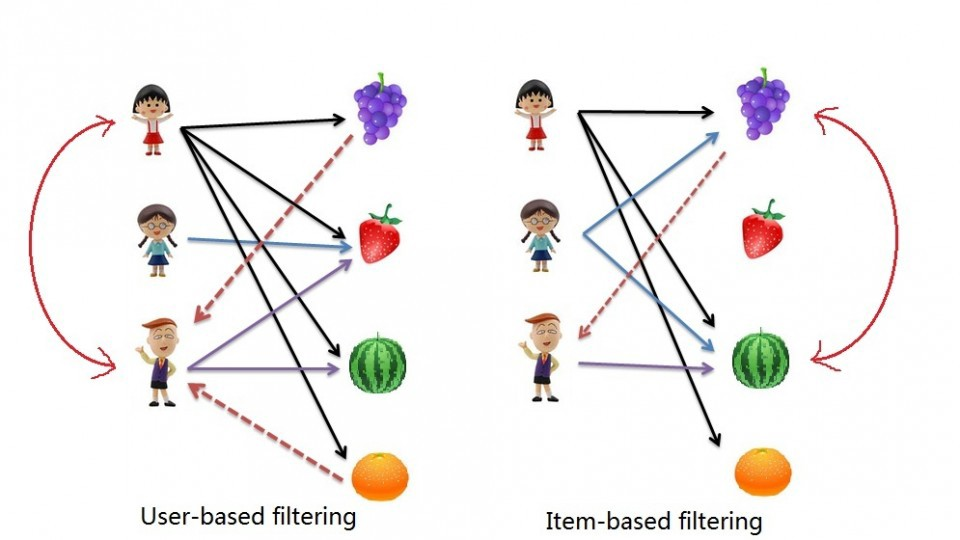
The process for creating a User Based recommendation system is as follows:
- Select a user with the movies the user has watched
- Based on his rating to movies, find the top X neighbours
- Get the watched movie record of the user for each neighbour.
- Calculate a similarity score using some formula
- Recommend the items with the highest score
Let's begin by creating an input user to recommend movies to:
Notice: To add more movies, simply increase the amount of elements in the userInput. Feel free to add more in! Just be sure to write it in with capital letters and if a movie starts with a "The", like "The Matrix" then write it in like this: 'Matrix, The' .
userInput = [
{'title':'Breakfast Club, The', 'rating':5},
{'title':'Toy Story', 'rating':3.5},
{'title':'Jumanji', 'rating':2},
{'title':"Pulp Fiction", 'rating':5},
{'title':'Akira', 'rating':4.5}
]
inputMovies = pd.DataFrame(userInput)
# inputMovies
#Filtering out the movies by title
inputId = movies_df[movies_df['title'].isin(inputMovies['title'].tolist())]
#Then merging it so we can get the movieId. It's implicitly merging it by title.
inputMovies = pd.merge(inputId, inputMovies)
#Dropping information we won't use from the input dataframe
inputMovies = inputMovies.drop('year', 1)
#Final input dataframe
#If a movie you added in above isn't here, then it might not be in the original
#dataframe or it might spelled differently, please check capitalisation.
# inputMovies
#Filtering out users that have watched movies that the input has watched and storing it
userSubset = ratings_df[ratings_df['movieId'].isin(inputMovies['movieId'].tolist())]
# userSubset.head()
#Groupby creates several sub dataframes where they all have the same value in the column specified as the parameter
userSubsetGroup = userSubset.groupby(['userId'])
userSubsetGroup.get_group(1130)
Let's also sort these groups so the users that share the most movies in common with the input have higher priority. This provides a richer recommendation since we won't go through every single user.
#Sorting it so users with movie most in common with the input will have priority
userSubsetGroup = sorted(userSubsetGroup, key=lambda x: len(x[1]), reverse=True)
userSubsetGroup = userSubsetGroup[0:100]
#Store the Pearson Correlation in a dictionary, where the key is the user Id and the value is the coefficient
pearsonCorrelationDict = {}
#For every user group in our subset
for name, group in userSubsetGroup:
#Let's start by sorting the input and current user group so the values aren't mixed up later on
group = group.sort_values(by='movieId')
inputMovies = inputMovies.sort_values(by='movieId')
#Get the N for the formula
nRatings = len(group)
#Get the review scores for the movies that they both have in common
temp_df = inputMovies[inputMovies['movieId'].isin(group['movieId'].tolist())]
#And then store them in a temporary buffer variable in a list format to facilitate future calculations
tempRatingList = temp_df['rating'].tolist()
#Let's also put the current user group reviews in a list format
tempGroupList = group['rating'].tolist()
#Now let's calculate the pearson correlation between two users, so called, x and y
Sxx = sum([i**2 for i in tempRatingList]) - pow(sum(tempRatingList),2)/float(nRatings)
Syy = sum([i**2 for i in tempGroupList]) - pow(sum(tempGroupList),2)/float(nRatings)
Sxy = sum( i*j for i, j in zip(tempRatingList, tempGroupList)) - sum(tempRatingList)*sum(tempGroupList)/float(nRatings)
#If the denominator is different than zero, then divide, else, 0 correlation.
if Sxx != 0 and Syy != 0:
pearsonCorrelationDict[name] = Sxy/sqrt(Sxx*Syy)
else:
pearsonCorrelationDict[name] = 0
# pearsonCorrelationDict.items()
pearsonDF = pd.DataFrame.from_dict(pearsonCorrelationDict, orient='index')
pearsonDF.columns = ['similarityIndex']
pearsonDF['userId'] = pearsonDF.index
pearsonDF.index = range(len(pearsonDF))
# pearsonDF.head()
# top 50 users that are most similar to the input.
topUsers=pearsonDF.sort_values(by='similarityIndex', ascending=False)[0:50]
# topUsers.head()
topUsersRating=topUsers.merge(ratings_df, left_on='userId', right_on='userId', how='inner')
# topUsersRating.head()
#Multiplies the similarity by the user's ratings
topUsersRating['weightedRating'] = topUsersRating['similarityIndex']*topUsersRating['rating']
# topUsersRating.head()
#Applies a sum to the topUsers after grouping it up by userId
tempTopUsersRating = topUsersRating.groupby('movieId').sum()[['similarityIndex','weightedRating']]
tempTopUsersRating.columns = ['sum_similarityIndex','sum_weightedRating']
# tempTopUsersRating.head()
#Creates an empty dataframe
recommendation_df = pd.DataFrame()
#Now we take the weighted average
recommendation_df['weighted average recommendation score'] = tempTopUsersRating['sum_weightedRating']/tempTopUsersRating['sum_similarityIndex']
recommendation_df['movieId'] = tempTopUsersRating.index
# recommendation_df.head()
recommendation_df = recommendation_df.sort_values(by='weighted average recommendation score', ascending=False)
recommendation_df.head(10)
movies_df.loc[movies_df['movieId'].isin(recommendation_df.head(10)['movieId'].tolist())]