Analyzing Data with Python
# # widen notebook cells
# from IPython.core.display import display, HTML
# display(HTML("<style>.container { width:95% !important; }</style>"))
The process of converting data from the initial format to a format that may be better for analysis.
# import libraries
import pandas as pd

# data source
filename = "https://s3-api.us-geo.objectstorage.softlayer.net/cf-courses-data/CognitiveClass/DA0101EN/auto.csv"

# headers
headers = ["symboling","normalized-losses","make","fuel-type","aspiration", "num-of-doors","body-style","drive-wheels","engine-location","wheel-base",
           "length","width","height","curb-weight","engine-type","num-of-cylinders", "engine-size","fuel-system","bore","stroke","compression-ratio",
           "horsepower","peak-rpm","city-mpg","highway-mpg","price"]

# read in the data set
df = pd.read_csv(filename, names = headers)

# see what the data set looks like
df.head()
i. Identify Missing Values
# import libraries
import numpy as np

# replace "?" with NaN
df.replace("?", np.nan, inplace = True)

# Evaluating for Missing Data using either .isnull() or .notnull()
missing_data = df.isnull()
missing_data.head()
ii. Deal with Missing Values
Options
1. Drop data
Example: "price" -- Any data entry without price data is essentially useless as it cannot be used for prediction
# drop all rows that do not have price data
df.dropna(subset=["price"], axis=0, inplace=True)

# reset index, because we droped two rows
df.reset_index(drop=True, inplace=True)
df.head()
2. Replace data -- less accurate since we replace w/ a guess
Example: "normalized-losses", "stroke", "bore", "horsepower", "peak-rpm"
# Calculate the average of the column
avg_norm_loss = df["normalized-losses"].astype("float").mean(axis=0)
avg_stroke = df["stroke"].astype("float").mean(axis = 0)
avg_bore = df['bore'].astype('float').mean(axis=0)
avg_horsepower = df['horsepower'].astype('float').mean(axis=0)
avg_peakrpm = df['peak-rpm'].astype('float').mean(axis=0)
# Replace "NaN" by mean value in "normalized-losses" column
df["normalized-losses"].replace(np.nan, avg_norm_loss, inplace=True)
df["stroke"].replace(np.nan, avg_stroke, inplace = True)
df["bore"].replace(np.nan, avg_bore, inplace=True)
df['horsepower'].replace(np.nan, avg_horsepower, inplace=True)
df['peak-rpm'].replace(np.nan, avg_peakrpm, inplace=True)
Example: "num-of-doors" -- Like all noncategorical variables there isn't an average fuel type, for example. 84% of sedans have four doors. Since four doors is most frequent, it is most likely to occur
# calculate the most common value in a particular column
mcv = df['num-of-doors'].value_counts().idxmax()

# replace the missing 'num-of-doors' values with the most frequent
df["num-of-doors"].replace(np.nan,mcv, inplace=True)
iii. Correct Data Format
.dtype()to check the data type.astype()to change the data type
# df.describe()
# df.describe(include = "all")
# df.inf0
# df.dtypes
# Convert data types to proper format
df[["bore", "stroke"]] = df[["bore", "stroke"]].astype("float")
df[["normalized-losses"]] = df[["normalized-losses"]].astype("int")
df[["price"]] = df[["price"]].astype("float")
df[["peak-rpm"]] = df[["peak-rpm"]].astype("float")

df.dtypes
iv. Data Standardization
Standardization is the process of transforming data into a common format which allows the researcher to make meaningful comparisons.
Example: In our dataset, the fuel consumption columns "city-mpg" and "highway-mpg" are represented by mpg (miles per gallon) unit. Assume we are developing an application in a country that accept the fuel consumption with the L/100km standard
We would need to transform mpg to L/100km:
L/100km = 235 / mpg
# Convert mpg to L/100km
df['city-L/100km'] = 235/df["city-mpg"]

# transform mpg to L/100km in the column of "highway-mpg"
df["highway-mpg"] = 235/df["highway-mpg"]

# change the name of the column from "highway-mpg" to "highway-L/100km"
df.rename(columns={'highway-mpg':'highway-L/100km'}, inplace=True)

# check your transformed data
df.head()
v. Data Normalization
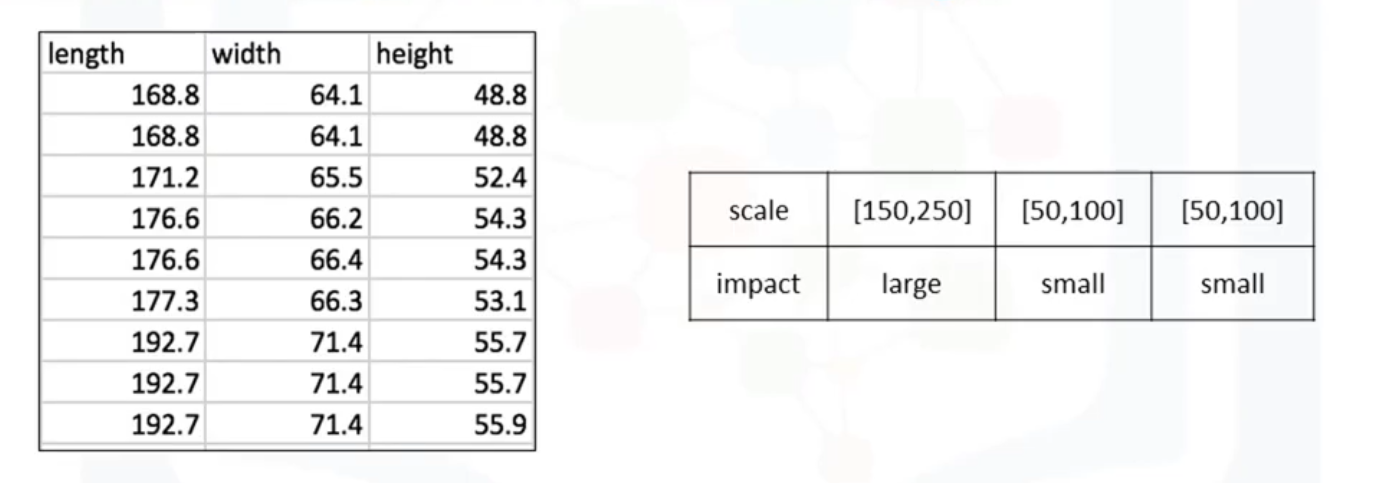
Different columns of numerical data may have very different ranges and direct comparison is often not meaningful. Normalization is a way to bring all data into a similar range for more useful comparison. Eg. In the used car data set, the feature "length" ranges from 150-250, while the features "width" and "height" range from 50-100. We could normalize these variables so that the range of the values is consistent.
Methods of Normalizing Data
- Simple Feature Scaling $$ x_{new} = \frac{x_{old}}{x_{max}} $$ Divide each value by the maximum value for that feature. New values range between zero and one.
df["length"] = df["length"]/df["length"].max()
- Min-Max $$ x_{new} = \frac{x_{old} - x_{min}}{x_{max} - x_{min}} $$ Min-Max takes each value X_old subtract it from the minimum value of that feature, then divides by the range of that feature. Again, new values range between 0 and 1
df["length"] = (df["length"] - df["length"].min())/ (df["length"].max() - df["length"].min())
- Z-Score or Standard Score $$x_{new} = \frac{x_{old} - \mu }{\sigma}$$ For each value you subtract mu (the average of the feature) and then divide by the standard deviation sigma. New values hover around zero, and typically range between negative three and positive three but can be higher or lower.
df["length"] = (df["length"] - df["length"].mean())/df["length"].std()
vi. Binning
Binning is a process of transforming continuous numerical variables into discrete categorical 'bins', for grouped analysis. For example, you can bin “age” into [0 to 5], [6 to 10], [11 to 15] and so on.
In our dataset, "horsepower" is a real valued variable ranging from 48 to 288, it has 57 unique values. What if we only care about the price difference between cars with high horsepower, medium horsepower, and little horsepower (3 types)? Can we rearrange them into three ‘bins' to simplify analysis?
# Convert data to correct format
df["horsepower"]= df["horsepower"].astype(int, copy=True)

# plot the histogram of horspower to see what the distribution of horsepower looks like
from matplotlib import pyplot
pyplot.hist(df["horsepower"])

# set x/y labels and plot title
pyplot.xlabel("horsepower")
pyplot.ylabel("count")
pyplot.title("horsepower bins")

# use numpy's linspace() functioin to get 3 bins of equal size bandwidth
bins = np.linspace(min(df["horsepower"]), max(df["horsepower"]), 4)

# set group names
group_names = ['Low', 'Medium', 'High']

# apply the function "cut" to determine what each value of "df['horsepower']" belongs to
df['horsepower-binned'] = pd.cut(df['horsepower'], bins, labels=group_names, include_lowest=True )
df[['horsepower','horsepower-binned']].head(5)
# draw historgram of attribute "horsepower" with bins = 3
pyplot.hist(df["horsepower"], bins = 3)

# set x/y labels and plot title
pyplot.xlabel("horsepower")
pyplot.ylabel("count")
pyplot.title("horsepower bins")

vii. Indicator variable
An indicator variable (or dummy variable) is a numerical variable used to label categories. They are called 'dummies' because the numbers themselves don't have inherent meaning. Indicator variables are used so we can use categorical variables for regression analysis in the later modules. Example:We see the column "fuel-type" has two unique values, "gas" or "diesel". Regression doesn't understand words, only numbers. To use this attribute in regression analysis, we convert "fuel-type" into indicator variables
# get indicator variables and assign it to data frame "dummy_variable_1"
dummy_variable_1 = pd.get_dummies(df["fuel-type"])

# change column names for clarity
dummy_variable_1.rename(columns={'fuel-type-diesel':'gas', 'fuel-type-diesel':'diesel'}, inplace=True)

# merge data frame "df" and "dummy_variable_1"
df = pd.concat([df, dummy_variable_1], axis=1)

# drop original column "fuel-type" from "df"
df.drop("fuel-type", axis = 1, inplace=True)
df.head()
EDA is an approach to analyze data in order to summarize the main characteristics of the data, gain better understanding of the data set, uncover relationships between different variables, and extract important variables for the problem we're trying to solve.
# ***load data and store in dataframe df***
# *final dataframe product after all the above treatment -- ready for analysis
path='https://s3-api.us-geo.objectstorage.softlayer.net/cf-courses-data/CognitiveClass/DA0101EN/automobileEDA.csv'
df = pd.read_csv(path)
i. Analyzing Individual Feature Patterns using Visualization
a. Continuous Numerical Variables
Continuous numerical variables may contain any value within some range. A great way to visualize these variables is by using scatterplots with fitted lines:
# import libraries
import seaborn as sns
import matplotlib.pylab as plt

# correlation between: bore, stroke,compression-ratio, and horsepower
# df[["bore", "stroke", "compression-ratio", "horsepower"]].corr()

# Engine size as potential predictor variable of price
sns.regplot(x="engine-size", y="price", data=df)
plt.ylim(0,)

# correlation between 'engine-size' and 'price' is approximately 0.87:
df[["engine-size", "price"]].corr()
A Positive linear relationship is observed between engine size and price. The correlation between 'engine-size' and 'price' is approximately 0.87. The Engine size feature therefore seems like a pretty good predictor of price since the regression line is almost a perfect diagonal line
b. Categorical Variables
The categorical variables can have the type "object" or "int64". A good way to visualize categorical variables is by using boxplots.
- The distributions of price between the different body-style categories have a significant overlap, and so body-style would not be a good predictor of price:
# the relationship between "body-style" and "price"
sns.boxplot(x="body-style", y="price", data=df)

- The distribution of price between two engine-location categories -- front and rear, are distinct enough to take engine-location as a potentially good predictor of price
sns.boxplot(x="engine-location", y="price", data=df)

- The distribution of price between the different drive-wheels categories differs; as such drive-wheels could potentially be a predictor of price.
# drive-wheels
sns.boxplot(x="drive-wheels", y="price", data=df)

ii. Descriptive Statistical Analysis
Value Counts
Note: the method value_counts only works on Pandas series, not Pandas Dataframes.
drive_wheels_counts = df['drive-wheels'].value_counts().to_frame()
drive_wheels_counts.rename(columns={'drive-wheels': 'value_counts'}, inplace=True)

# rename the index to 'drive-wheels'
drive_wheels_counts.index.name = 'drive-wheels'
drive_wheels_counts
iii. Basics of Grouping
Say we want to know, on average, which type of drive wheel is most valuable, we can group "drive-wheels" and then average them
# group by the variable "drive-wheels"
# df['drive-wheels'].unique()
# select columns
df_group_one = df[['drive-wheels','body-style','price']]

# calculate the average price for each of the different categories of data
df_group_one = df_group_one.groupby(['drive-wheels'],as_index=False).mean()
df_group_one
# You can also group with multiple variables
# group dataframe by the unique combinations 'drive-wheels' and 'body-style'
df_gptest = df[['drive-wheels','body-style','price']]
grouped_test1 = df_gptest.groupby(['drive-wheels','body-style'],as_index=False).mean()
grouped_test1
# grouped data is much easier to visualize when it is made into a pivot table
# A pivot table is like an Excel spreadsheet, with one variable along the column and another along the row
grouped_pivot = grouped_test1.pivot(index='drive-wheels',columns='body-style')
grouped_pivot
# fill missing values with 0
grouped_pivot = grouped_pivot.fillna(0)
grouped_pivot
# Let's use a heat map to visualize the relationship between Body Style vs Price
# The heatmap plots the target variable (price) proportional to colour with
# respect to the variables 'drive-wheel' and 'body-style' in the vertical and horizontal axis respectively
# This allows us to visualize how the price is related to 'drive-wheel' and 'body-style'.

fig, ax = plt.subplots()
im = ax.pcolor(grouped_pivot, cmap='RdBu')

#label names
row_labels = grouped_pivot.columns.levels[1]
col_labels = grouped_pivot.index

#move ticks and labels to the center
ax.set_xticks(np.arange(grouped_pivot.shape[1]) + 0.5, minor=False)
ax.set_yticks(np.arange(grouped_pivot.shape[0]) + 0.5, minor=False)

#insert labels
ax.set_xticklabels(row_labels, minor=False)
ax.set_yticklabels(col_labels, minor=False)

#rotate label if too long
plt.xticks(rotation=90)

fig.colorbar(im)
plt.show()

iv. Correlation and Causation
Pearson Correlation
Pearson Correlation is the default method of the function corr. We can calculate the Pearson Correlation of 'int64' or 'float64' variables. The Pearson Correlation coefficient is a value between -1 and 1 inclusive, where:
- 1: Total positive linear correlation.
- 0: No linear correlation, the two variables most likely do not affect each other.
- -1: Total negative linear correlation.
P-value
The P-value tells us how certain we are about the correlation we calculated
Normally, we choose a significance level of 0.05, which means that we are 95% confident that the correlation between the
variables is significant. By convention, when the:
p-value is < 0.001:there is strong evidence that the correlation is significant.p-value is < 0.05:there is moderate evidence that the correlation is significant.p-value is < 0.1:there is weak evidence that the correlation is significant.p-value is > 0.1:there is no evidence that the correlation is significant.
# import libraries
from scipy import stats

# Horsepower vs Price
pearson_coef, p_value = stats.pearsonr(df['horsepower'], df['price'])
print("The Pearson Correlation Coefficient is", pearson_coef, " with a P-value of P = ", p_value)
Conclusion: Since the p-value is < 0.001, the correlation between horsepower and price is statistically significant, and the linear relationship is quite strong (~0.809, close to 1)
v. Analysis of Variance (ANOVA)
The ANOVA is a statistical method used to:
- test whether there are significant differences between the means of two or more groups.
- [It can be used to] find the correlation between different groups of a categorical variable.
F-test score: variation between sample group means divided by variation within sample group.
ANOVA assumes the means of all groups are the same, calculates how much the actual means deviate from the assumption, and reports it as the F-test score.
A larger score means there is a larger difference between the means.p-value: p-value, a.k.a. confidence degree a.k.a. Statistical significance tells how statistically significant our calculated score value is
Drive Wheels
Since ANOVA analyzes the difference between different groups of the same variable, the groupby function will come in handy. Let's see if different types 'drive-wheels' impact 'price'
# we group the data
# grouped_test2=df_gptest[['drive-wheels', 'price']].groupby(['drive-wheels'])
grouped_test2=df[['drive-wheels', 'price']].groupby(['drive-wheels'])

# obtain the values of the method group using the method "get_group".
grouped_test2.get_group('4wd')['price']

# use the function 'f_oneway' in the module 'stats' to obtain the F-test score and P-value.
f_val, p_val = stats.f_oneway(grouped_test2.get_group('fwd')['price'], grouped_test2.get_group('rwd')['price'], grouped_test2.get_group('4wd')['price'])

print( "ANOVA results: F=", f_val, ", P =", p_val)
This is a great result with a large F test score showing a strong correlation and a P value of almost 0 implying almost certain statistical significance.
# Separately: fwd and rwd
f_val, p_val = stats.f_oneway(grouped_test2.get_group('fwd')['price'], grouped_test2.get_group('rwd')['price'])

print( "ANOVA results: F=", f_val, ", P =", p_val )
# 4wd and rwd
f_val, p_val = stats.f_oneway(grouped_test2.get_group('4wd')['price'], grouped_test2.get_group('rwd')['price'])

print( "ANOVA results: F=", f_val, ", P =", p_val)
# 4wd and fwd
f_val, p_val = stats.f_oneway(grouped_test2.get_group('4wd')['price'], grouped_test2.get_group('fwd')['price'])

print("ANOVA results: F=", f_val, ", P =", p_val)
Conclusion: Important Variables
We now have a better idea of what our data looks like and which variables are important to take into account when predicting the car price. We have narrowed it down to the following variables:
| 1. Continuous numerical variables | 2. Categorical variables |
|---|---|
| Length | Drive-wheels |
| Width | |
| Curb-weight | |
| Engine-size | |
| Horsepower | |
| City-mpg | |
| Highway-mpg | |
| Wheel-base | |
| Bore |
As we now move into building machine learning models to automate our analysis, feeding the model with variables that meaningfully affect our target variable will improve our model's prediction performance.
# load data and store in dataframe df
path = 'https://s3-api.us-geo.objectstorage.softlayer.net/cf-courses-data/CognitiveClass/DA0101EN/automobileEDA.csv'

df = pd.read_csv(path)
df.head()
i. (Simple) Linear Regression
SLR helps us understand the relationship between 2 variables:
- The predictor/independent variable(x)
- The target/dependent variable (y)
The result of Linear Regression is a linear function that predicts the response/target/dependent variable as a function of the predictor/independent variable.
$$Linear function: Yhat = a + b X $$- a -- the intercept of the regression line; in other words: the value of Y when X is 0
- b -- the slope of the regression line, in other words: the value with which Y changes when X increases by 1 unit
How could Highway-mpg help us predict car price?
To find out, we will use simple linear regression to create a linear function with "highway-mpg" as the predictor variable and the "price" as the response variable.
# import libraries
# load the modules for linear regression
from sklearn.linear_model import LinearRegression

# definte the variables
X = df[['highway-mpg']]
Y = df['price']

# Create the linear regression object
lm = LinearRegression()

# Fit the linear model using highway-mpg
lm.fit(X,Y)
# What is the value of the intercept (a)?
lm.intercept_
# What is the value of the Slope (b)?
lm.coef_
ii. Multiple Linear Regression
Multiple Linear Regression is used to explain the relationship between one continuous dependent variable and two or more independent variables. Most real-world regression models involve multiple predictor/independent variables. We will illustrate the structure by using four predictor variables, but these results can generalize to any integer:
$$ Y: Response \ Variable\\ X_1 :Predictor\ Variable \ 1\\ X_2: Predictor\ Variable \ 2\\ X_3: Predictor\ Variable \ 3\\ X_4: Predictor\ Variable \ 4\\ $$$$ a: intercept\\ b_1 :coefficients \ of\ Variable \ 1\\ b_2: coefficients \ of\ Variable \ 2\\ b_3: coefficients \ of\ Variable \ 3\\ b_4: coefficients \ of\ Variable \ 4\\ $$$$ Yhat = a + b_1 X_1 + b_2 X_2 + b_3 X_3 + b_4 X_4 $$From the previous section we know that other good predictors of price could be:
- Horsepower
- Curb-weight
- Engine-size
- Highway-mpg
# develop a model using these variables as the predictor variables
Z = df[['horsepower', 'curb-weight', 'engine-size', 'highway-mpg']]

# Fit the linear model using the four above-mentioned variables.
# lm.fit(Z, df['price'])
lm.fit(Z, Y)
# What is the value of the intercept(a)?
lm.intercept_
# What are the values of the coefficients (b1, b2, b3, b4)?
lm.coef_
What is the final estimated linear model that we get?
iii. Model Evaluation using Visualization
Now that we've developed some models, how do we evaluate our models and how do we choose the best one? One way to do this is by using visualization.
Regression Plot
This plot shows a combination of a scatter plot, as well as the fitted linear regression line going through the data. This will give us a reasonable estimate of:
- The relationship between the two variables
- the strength of the correlation
- the direction (positive or negative correlation)
# Horsepower as potential predictor variable of price
width = 12
height = 10
plt.figure(figsize=(width, height))
sns.regplot(x="highway-mpg", y="price", data=df)
plt.ylim(0,)

Pay attention to how scattered the data points are around the regression line. This will give you a good indication of the variance of the data, and whether a linear model would be the best fit or not. If the data is too far off from the line, this linear model might not be the best model for the data.
# peak-rpm" as potential predictor variable of price
plt.figure(figsize=(width, height))
sns.regplot(x="peak-rpm", y="price", data=df)
plt.ylim(0,)

Comparing the regression plot of "peak-rpm" and "highway-mpg" we see that the points for "highway-mpg" are much closer to the generated line and on the average decrease. The points for "peak-rpm" have more spread around the predicted line, and it is much harder to determine if the points are decreasing or increasing
df[["peak-rpm","highway-mpg","price"]].corr()
a. Residual Plot
The residual (e) is the difference between the observed value (y) and the predicted value (Yhat). When we look at a regression plot, the residual is the distance from the data point to the fitted regression line.
A residual plot is a graph that shows the residuals on the vertical y-axis and the independent variable on the horizontal axis
When looking at a residual plot, pay attention to the spread of the residuals:
- If the points are randomly spread out around the x-axis, then a linear model is appropriate for the data. Randomly spread out residuals means that the variance is constant, and thus the linear model is a good fit for this data.
In the residual plot below, the residuals are not randomly spread around the x-axis, which leads us to believe that maybe a non-linear model is more appropriate for this data.
plt.figure(figsize=(width, height))
sns.residplot(x=df['highway-mpg'], y=df['price'])
plt.show()

b. Distribution Plot
Visualizing a model for Multiple Linear Regression is a bit more complicated because you can't visualize it with a regression or residual plot.
One way to look at the fit of the model is by looking at the distribution plot.
We can look at the distribution of the fitted values that result from the model and compare it to the distribution of the actual values.
# First lets make a prediction
Y_hat = lm.predict(Z)
plt.figure(figsize=(width, height))

#kind{“hist”, “kde”, “ecdf”}
ax1 = sns.kdeplot(df['price'], color="r", label="Actual Value")
sns.kdeplot(Y_hat, color="b", label="Fitted Values" , ax=ax1)

plt.title('Actual vs Fitted Values for Price')
plt.xlabel('Price (in dollars)')
plt.ylabel('Proportion of Cars')

plt.show()
plt.close()

We can see that the fitted values are reasonably close to the actual values, since the two distributions overlap a bit. However, there is definitely some room for improvement.
iv. Polynomial Regression and Pipelines
Polynomial regression is a particular case of the simple linear regression model or multiple linear regression models.
We get non-linear relationships by squaring or setting higher-order terms of the predictor variables.
There are different orders of polynomial regression:
We saw earlier that a linear model did not provide the best fit while using highway-mpg as the predictor variable. Let's see if we can try fitting a polynomial model to the data instead. We will use the following function to plot the data:
def PlotPolly(model, independent_variable, dependent_variable, Name):
    x_new = np.linspace(15, 55, 100)
    y_new = model(x_new)

    plt.rcParams["figure.figsize"] = (12,12)

    plt.plot(independent_variable, dependent_variable, '.', x_new, y_new, '-')
    plt.title('Polynomial Fit with Matplotlib for Price ~ Length')
    ax = plt.gca()
    ax.set_facecolor((0.898, 0.898, 0.898))
    fig = plt.gcf()
    plt.xlabel(Name)
    plt.ylabel('Price of Cars')

    plt.show()
    plt.close()
# get the variables
x = df['highway-mpg']
y = df['price']

# fit the polynomial using the function polyfit, then use the function poly1d to display the polynomial function.
# Here we use a polynomial of the 3rd order (cubic)
f = np.polyfit(x, y, 3)
p = np.poly1d(f)
print(p)
# plot the function
PlotPolly(p, x, y, 'highway-mpg')

We can already see from plotting that this polynomial model performs better than the linear model. This is because the generated polynomial function "hits" more of the data points.
The analytical expression for Multivariate Polynomial function gets complicated. For example, the expression for a second-order (degree=2) polynomial with two variables is given by: $$ Yhat = a + b_1 X_1 +b_2 X_2 +b_3 X_1 X_2+b_4 X_1^2+b_5 X_2^2 $$
We can perform a polynomial transform on multiple features (variables):
# import libraries
from sklearn.preprocessing import PolynomialFeatures

# create a PolynomialFeatures object of degree 2
pr=PolynomialFeatures(degree=2)

Z_pr=pr.fit_transform(Z)
In the original data, there are 201 samples and 4 features:
Z.shape
After the transformation, there are 201 samples and 15 features:
Z_pr.shape
Pipeline
Data Pipelines simplify the steps of processing the data.
from sklearn.pipeline import Pipeline
from sklearn.preprocessing import StandardScaler
Input=[('scale',StandardScaler()), ('polynomial', PolynomialFeatures(include_bias=False)), ('model',LinearRegression())]
pipe=Pipeline(Input)
pipe
Z = Z.astype(float)
pipe.fit(Z,y)
ypipe=pipe.predict(Z)
ypipe[0:3]
v. Measures for In-Sample Evaluation
When evaluating our models, not only do we want to visualize the results, we also want a quantitative measure of it
Two very important measures often used in Statistics are:
A measure to indicate how close the data is to the fitted regression line.
The value of the R-squared is the percentage of variation of the response variable (y) that is explained by a linear model
MSE measures the average of the squares of errors -- that is, the difference between actual value (y) and the estimated value (ŷ).
Model 1: Simple Linear Regression
R^2:
# highway_mpg_fit
lm.fit(X, Y)
print('The R-square is: ', lm.score(X, Y))
We can say that ~49.659% of the variation of the price is explained by this simple linear model "horsepower_fit".
MSE:
from sklearn.metrics import mean_squared_error

# predict the output
Yhat=lm.predict(X)
# print('The output of the first four predicted value is: ', Yhat[0:4])

# compare the predicted results with the actual results
mse = mean_squared_error(df['price'], Yhat)
print('The mean square error of price and predicted value is: ', mse)
Model 2: Multiple Linear Regression
R^2:
# fit the model
lm.fit(Z, df['price'])
# Find the R^2
print('The R-square is: ', lm.score(Z, df['price']))
We can say that ~80.896 % of the variation of price is explained by this multiple linear regression "multi_fit".
MSE:
# produce a prediction
Y_predict_multifit = lm.predict(Z)

# compare the predicted results with the actual results
print('The mean square error of price and predicted value using multifit is: ', \
      mean_squared_error(df['price'], Y_predict_multifit))
Model 3: Polynomial Fit
R^2:
from sklearn.metrics import r2_score

r_squared = r2_score(y, p(x))
print('The R-square value is: ', r_squared)
We can say that ~67.419 % of the variation of price is explained by this polynomial fit.
MSE:
mean_squared_error(df['price'], p(x))
vi. Prediction and Decision Making
a. Prediction
In the previous section, we trained the model using the method fit.
Now we will use the method predict to produce a prediction.
new_input=np.arange(1, 100, 1).reshape(-1, 1)
# Fit the model:
lm.fit(X.values, Y)

# Produce a prediction
yhat=lm.predict(new_input)
yhat[0:3]
# plot the data
plt.plot(new_input, yhat)
plt.show()

b. Decision Making: Determining a Good Model Fit
Now that we have visualized the different models, and generated the R-squared and MSE values for the fits, how do we determine a good model fit?
- What is a good R-squared value? -- Models with higher R-squared values are better fits for data
- What is a good MSE? -- Models with smaller MSE values are better fits for data
Conclusion
Comparing the SLR, MLR amd Polynimial regression models, we conclude that the MLR model is the best model for predicting price from our dataset. This result makes sense since we have 27 variables in total and we know that more than one of those variables is a potential predictor of the final car price.
We have built models and made predictions (of vehicle prices). Now we will determine how accurate these predictions are
# Import clean data
path = 'https://s3-api.us-geo.objectstorage.softlayer.net/cf-courses-data/CognitiveClass/DA0101EN/module_5_auto.csv'
df = pd.read_csv(path)

# First lets only use numeric data
df=df._get_numeric_data()
df.head()
# Libraries for plotting
from IPython.display import display
from ipywidgets import interact, interactive, fixed, interact_manual, widgets

# Functions for plotting
def DistributionPlot(RedFunction, BlueFunction, RedName, BlueName, Title):
    width = 12
    height = 10
    plt.figure(figsize=(width, height))

#     ax1 = sns.distplot(RedFunction, hist=False, color="r", label=RedName)
#     ax2 = sns.distplot(BlueFunction, hist=False, color="b", label=BlueName, ax=ax1)
    ax1 = sns.kdeplot(RedFunction, color="r", label=RedName)
    ax2 = sns.kdeplot(BlueFunction, color="b", label=BlueName, ax=ax1)

    plt.title(Title)
    plt.xlabel('Price (in dollars)')
    plt.ylabel('Proportion of Cars')

    plt.show()
    plt.close()


def PollyPlot(xtrain, xtest, y_train, y_test, lr,poly_transform):
    width = 12
    height = 10
    plt.figure(figsize=(width, height))

    xmax=max([xtrain.values.max(), xtest.values.max()])
    xmin=min([xtrain.values.min(), xtest.values.min()])

    x=np.arange(xmin, xmax, 0.1)

    plt.plot(xtrain, y_train, 'ro', label='Training Data')
    plt.plot(xtest, y_test, 'go', label='Test Data')
    plt.plot(x, lr.predict(poly_transform.fit_transform(x.reshape(-1, 1))), label='Predicted Function')
    plt.ylim([-10000, 60000])
    plt.ylabel('Price')
    plt.legend()
i. Training and Testing
An important step in testing your model is to split your data into training and testing data.
R^2
# place the target data price in a separate dataframe y:
y_data = df['price']

# drop price data in x data
x_data=df.drop('price',axis=1)
# x_data.head()

# Now we randomly split our data into training and testing data using the function train_test_split
from sklearn.model_selection import train_test_split

# split up the data set such that 15% of the data samples will be used for testing
x_train, x_test, y_train, y_test = train_test_split(x_data, y_data, test_size=0.15, random_state=1)

#y_train = a + b(x_train)
#y_hat   = a + b(x_test)
#lre.score below creates/predicsts y_hat and compares it with y_test and gives a score


print("number of test samples :", x_test.shape[0])
print("number of training samples:",x_train.shape[0])
# import LinearRegression
from sklearn.linear_model import LinearRegression

# create a Linear Regression object
lre=LinearRegression()

# fit the model using the feature horsepower
lre.fit(x_train[['horsepower']], y_train)

# Calculate the R^2 on the test data
lre.score(x_test[['horsepower']], y_test)
lre.score(x_train[['horsepower']], y_train)
Cross-validation Score
from sklearn.model_selection import cross_val_score

# Calculate the average R^2 using four folds, and 'horsepower' as a feature
# We input the object, the feature in this case ' horsepower', the target data (y_data).
# The parameter 'cv' determines the number of folds; in this case 4.
# The default scoring is R^2; each element in the array has the average R^2 value in the fold
Rcross = cross_val_score(lre, x_data[['horsepower']], y_data, cv=4)
Rcross
# calculate the average and standard deviation of our estimate(Rcross):
print("The mean of the folds are", Rcross.mean(), "and the standard deviation is" , Rcross.std())
Negative Squared Error
-1 * cross_val_score(lre,x_data[['horsepower']], y_data,cv=4,scoring='neg_mean_squared_error')
You can also use the function 'cross_val_predict' to predict the output. The function splits up the data into the specified number of folds, using one fold to get a prediction while the rest of the folds are used as test data.
from sklearn.model_selection import cross_val_predict
# We input the object, the feature in this case 'horsepower' , the target data y_data.
# The parameter 'cv' determines the number of folds; in this case 4. We can produce an output:
yhat = cross_val_predict(lre,x_data[['horsepower']], y_data,cv=4)
yhat[0:5]
ii. Overfitting
- Overfitting occurs when the model fits the noise, not the underlying process.
- Note: The test data -- sometimes referred to as the out of sample data -- is a much better measure of how well your model performs in the real world:
# create Multiple linear regression object
lr = LinearRegression()

# train the model using 'horsepower', 'curb-weight', 'engine-size' and 'highway-mpg' as features.
lr.fit(x_train[['horsepower', 'curb-weight', 'engine-size', 'highway-mpg']], y_train)

# Prediction using training data:
yhat_train = lr.predict(x_train[['horsepower', 'curb-weight', 'engine-size', 'highway-mpg']])
yhat_train[0:5]
# Prediction using test data:
yhat_test = lr.predict(x_test[['horsepower', 'curb-weight', 'engine-size', 'highway-mpg']])
yhat_test[0:5]
Let's perform some model evaluation using our training and testing data separately
# import the seaborn and matplotlib
import matplotlib.pyplot as plt
import seaborn as sns

# examine the distribution of the predicted values of the training data.
plt.figure(figsize=(width, height))
ax1 = sns.kdeplot(y_train, color="r", label="Actual Values (Train)")
sns.kdeplot(yhat_train, color="b", label = "Predicted Values (Train)", legend=True, ax=ax1)

plt.title('Distribution  Plot of  Predicted Value Using Training Data vs Training Data Distribution')
plt.xlabel('Price (in dollars)')
plt.ylabel('Proportion of Cars')

plt.legend(bbox_to_anchor=(1.05, 1), loc=2, borderaxespad=0.)

plt.show()
plt.close()

Figure 1: Plot of predicted values using the training data compared to the training data.
So far the model seems to be doing well in learning from the training dataset. But what happens when the model encounters new data from the testing dataset? When the model generates new values from the test data, we see the distribution of the predicted values is much different from the actual target values.
# import the seaborn and matplotlib
import matplotlib.pyplot as plt
import seaborn as sns

# examine the distribution of the predicted values of the training data.
plt.figure(figsize=(width, height))
ax1 = sns.kdeplot(y_test, color="r", label="Actual Values (Test)")
sns.kdeplot(yhat_test, color="b", label = "Predicted Values (Test)", legend=True, ax=ax1)

plt.title('Distribution  Plot of  Predicted Value Using Test Data vs Data Distribution of Test Data')
plt.xlabel('Price (in dollars)')
plt.ylabel('Proportion of Cars')

plt.legend(bbox_to_anchor=(1.05, 1), loc=2, borderaxespad=0.)

plt.show()
plt.close()

Figure 2: Plot of predicted value using the test data compared to the test data.
Comparing Figure 1 and Figure 2, it is evident that the distribution of the test data in Figure 1 is much better at fitting the data. This difference in Figure 2 is apparent where the ranges are from 5000 to 15 000. This is where the distribution shape is exceptionally different. Let's see if polynomial regression also exhibits a drop in the prediction accuracy when analysing the test dataset.
from sklearn.preprocessing import PolynomialFeatures
x_train, x_test, y_train, y_test = train_test_split(x_data, y_data, test_size=0.45, random_state=0)

# We will perform a degree 5 polynomial transformation on the feature 'horse power'
pr = PolynomialFeatures(degree=5)
x_train_pr = pr.fit_transform(x_train[['horsepower']])
x_test_pr = pr.fit_transform(x_test[['horsepower']])
pr
# create a linear regression model "poly" and train it
poly = LinearRegression()
poly.fit(x_train_pr, y_train)
# We can see the output of our model using the method "predict." then assign the values to "yhat"
yhat = poly.predict(x_test_pr)

# Let's take the first five predicted values and compare it to the actual targets.
print("Predicted values:", yhat[0:4])
print("True values:", y_test[0:4].values)
# use the function "PollyPlot" that we defined at the beginning of the lab
# to display the training data, testing data, and the predicted function.
PollyPlot(x_train[['horsepower']], x_test[['horsepower']], y_train, y_test, poly,pr)

Figure 4 A polynomial regression model. Red dots represent training data, green dots represent test data, and the blue line represents the model prediction.
We see that the estimated function appears to track the data but around 200 horsepower, the function begins to diverge from the data points.
R^2 of the training data:
poly.score(x_train_pr, y_train)
R^2 of the test data:
poly.score(x_test_pr, y_test)
We see the R^2 for the training data is 0.5567 while the R^2 on the test data was -29.87. The lower the R^2, the worse the model, a Negative R^2 is a sign of overfitting. Let's see how the R^2 changes on the test data for different order polynomials and plot the results:
Rsqu_test = []

order = [1, 2, 3, 4]
for n in order:
    pr = PolynomialFeatures(degree=n)

    x_train_pr = pr.fit_transform(x_train[['horsepower']])

    x_test_pr = pr.fit_transform(x_test[['horsepower']])

    lr.fit(x_train_pr, y_train)

    Rsqu_test.append(lr.score(x_test_pr, y_test))

plt.plot(order, Rsqu_test)
plt.xlabel('order')
plt.ylabel('R^2')
plt.title('R^2 Using Test Data')
plt.text(3, 0.75, 'Maximum R^2 ')

We see the R^2 gradually increases until an order three polynomial is used. Then the R^2 dramatically decreases at four.
def f(order, test_data):
    x_train, x_test, y_train, y_test = train_test_split(x_data, y_data, test_size=test_data, random_state=0)
    pr = PolynomialFeatures(degree=order)
    x_train_pr = pr.fit_transform(x_train[['horsepower']])
    x_test_pr = pr.fit_transform(x_test[['horsepower']])
    poly = LinearRegression()
    poly.fit(x_train_pr,y_train)
    PollyPlot(x_train[['horsepower']], x_test[['horsepower']], y_train,y_test, poly, pr)
The following interface allows you to experiment with different polynomial orders and different amounts of data.
interact(f, order=(0, 6, 1), test_data=(0.05, 0.95, 0.05))
Polynomial transformations with more than one feature
# Create a "PolynomialFeatures" object "pr1" of degree two
pr1=PolynomialFeatures(degree=2)

# Transform the training and testing samples for the features 'horsepower', 'curb-weight', 'engine-size' and 'highway-mpg'
x_train_pr1=pr.fit_transform(x_train[['horsepower', 'curb-weight', 'engine-size', 'highway-mpg']])

x_test_pr1=pr.fit_transform(x_test[['horsepower', 'curb-weight', 'engine-size', 'highway-mpg']])
How many dimensions does the new feature have? Hint: use the attribute "shape"
x_train_pr1.shape
# There are now 15 features:
# Create a linear regression model "poly1" and train the object using the method "fit" using the polynomial features
poly1=LinearRegression().fit(x_train_pr1,y_train)
# predict an output on the polynomial features
yhat_test1=poly1.predict(x_test_pr1)

# display the distribution of the predicted output vs the test data
Title='Distribution  Plot of  Predicted Value Using Test Data vs Data Distribution of Test Data'
DistributionPlot(y_test, yhat_test1, "Actual Values (Test)", "Predicted Values (Test)", Title)

# perform a degree two polynomial transformation on our data
# NB: our test data will be used as validation data
pr=PolynomialFeatures(degree=2)
x_train_pr=pr.fit_transform(x_train[['horsepower', 'curb-weight', 'engine-size', 'highway-mpg','normalized-losses','symboling']])
x_test_pr=pr.fit_transform(x_test[['horsepower', 'curb-weight', 'engine-size', 'highway-mpg','normalized-losses','symboling']])

# import Ridge
from sklearn.linear_model import Ridge

# create a Ridge regression object, setting the regularization parameter to 0.1
# create a Ridge regression object, setting the regularization parameter to 0.2
RigeModel=Ridge(alpha=0.2)

#  fit the model
RigeModel.fit(x_train_pr, y_train)
# obtain a prediction
yhat = RigeModel.predict(x_test_pr)

# compare the first five predicted samples to our test set
print('predicted:', yhat[0:4])
print('test set :', y_test[0:4].values)
# We select the value of Alfa that minimizes the test error, for example, we can use a for loop.
Rsqu_test = []
Rsqu_train = []
dummy1 = []
ALFA = 10 * np.array(range(0,1000))
for alfa in ALFA:
    RigeModel = Ridge(alpha=alfa)
    RigeModel.fit(x_train_pr, y_train)
    Rsqu_test.append(RigeModel.score(x_test_pr, y_test))
    Rsqu_train.append(RigeModel.score(x_train_pr, y_train))


# plot out the value of R^2 for different Alphas
width = 12
height = 10
plt.figure(figsize=(width, height))

plt.plot(ALFA,Rsqu_test, label='validation data  ')
plt.plot(ALFA,Rsqu_train, 'r', label='training Data ')
plt.xlabel('alpha')
plt.ylabel('R^2')
plt.legend()

Figure 6:The blue line represents the R^2 of the test data, and the red line represents the R^2 of the training data. The x-axis represents the different values of Alfa. The red line in figure 6 represents the R^2 of the test data, as Alpha increases the R^2 decreases; therefore as Alfa increases the model performs worse on the test data. The blue line represents the R^2 on the validation data, as the value for Alfa increases the R^2 decreases.
Task 4):
Perform Ridge regression and calculate the R^2 using the polynomial features, use the training data to train the model and test data to test the model. The parameter alpha should be set to 10.RigeModel = Ridge(alpha=0)
RigeModel.fit(x_train_pr, y_train)
RigeModel.score(x_test_pr, y_test)
# import GridSearchCV
from sklearn.model_selection import GridSearchCV

# We create a dictionary of parameter values
parameters1= [{'alpha': [0.001,0.1,1, 10, 100, 1000, 10000, 100000, 100000]}]
parameters1
# Create a ridge regions object
RR=Ridge()
RR
# Create a ridge grid search object
Grid1 = GridSearchCV(RR, parameters1,cv=4)

# Fit the model
Grid1.fit(x_data[['horsepower', 'curb-weight', 'engine-size', 'highway-mpg']], y_data)
The object finds the best parameter values on the validation data. We can obtain the estimator with the best parameters and assign it to the variable BestRR as follows:
BestRR=Grid1.best_estimator_
BestRR
# test our model on the test data
BestRR.score(x_test[['horsepower', 'curb-weight', 'engine-size', 'highway-mpg']], y_test)